Lyft has the prediction algorithms, real-time monitoring, and incentive programs already built. None of it reaches riders. I designed the UX layer that puts it in front of them.
Overview
Problem
I'm a Lyft bike user. I'd check availability at home, ride 15 minutes, and find all docks taken. Repeatedly. Personal frustration became the design brief. When I dug into the system, the same pattern kept showing up across three breakdowns that look separate but trace back to one cause: Lyft's prediction infrastructure was never exposed to riders.
Riders can't see whether a dock will be open when they arrive, so every ride is a gamble
If the docks fill up mid-ride, there's no recovery and the rider gets stranded
Dock imbalance costs Lyft millions in truck redistribution. Rebalancing moves dropped 80% from 2014 to 2022, but the cost is still material (NYC Comptroller, 2023)

The Solution
Lyft already has everything it needs. AirControl monitors stations in real time. Bike Angels pays riders to rebalance the network, with top users earning $3K a month (Bloomberg, 2022). Internal prediction algorithms forecast dock availability. The iOS Live Activities API can deliver mid-ride notifications without making the rider touch their phone. None of this reaches riders today. My design is the UX layer that exposes it. There's no new technology involved, mostly a frontend lift.
01.
Dynamic pricing at station selection
Price is the incentive. No badges, no banners.
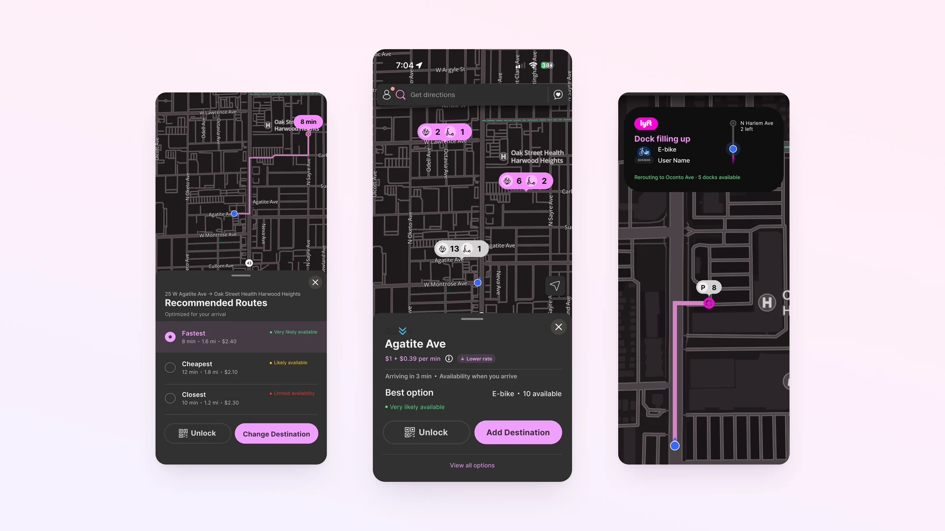
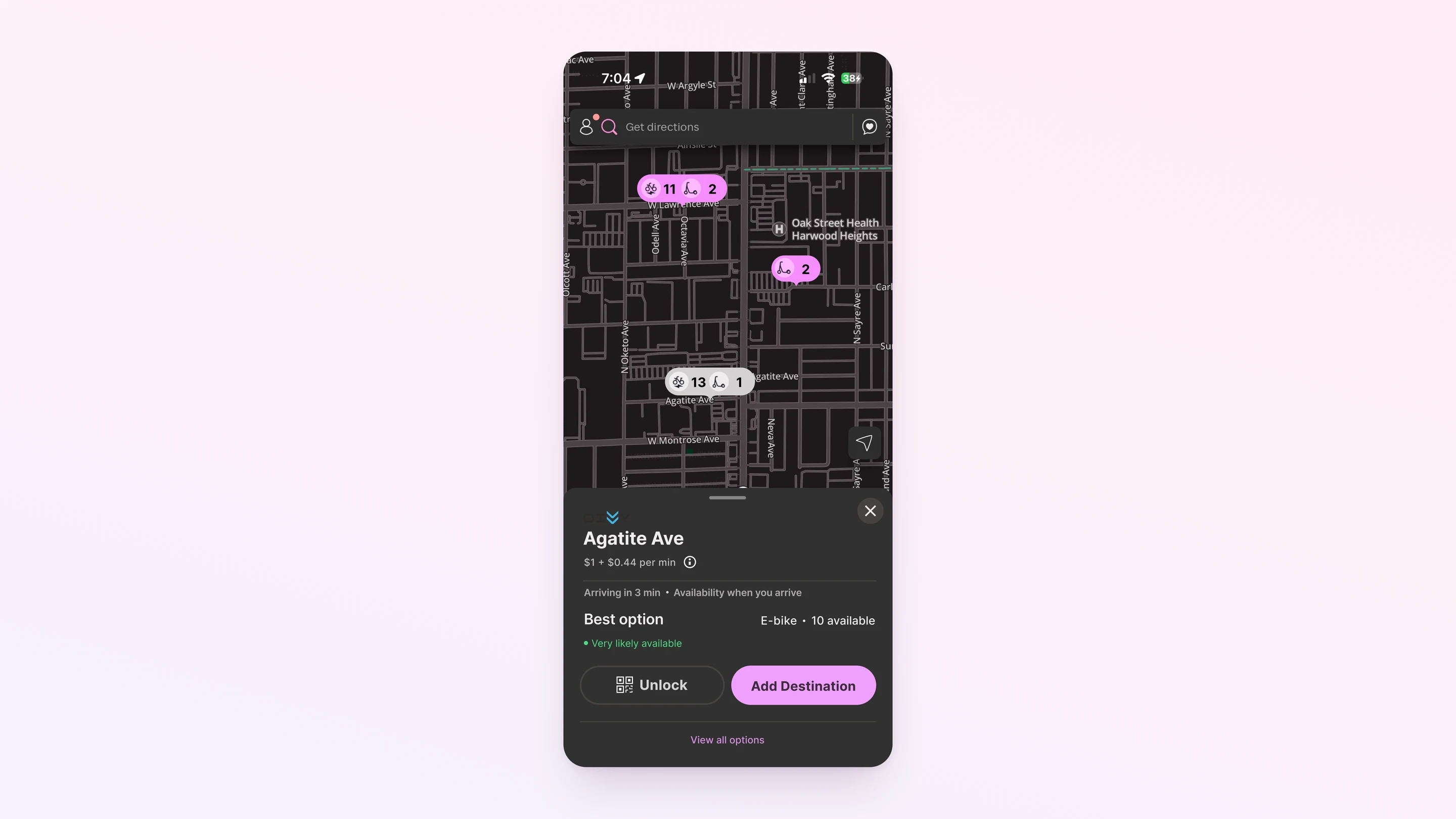
The per-minute rate moves with station supply. Overstocked stations price lower ($0.39/min) to clear bikes for riders arriving later. Understocked stations price higher ($0.49/min) to protect what's left. The incentive sits inside a number riders already compare, so it needs no new UI. Published research on departure-side pricing backs this up: +300% revenue and -76% rebalancing cost versus fixed pricing (PMC, 2025).
02.
Recommended routes with dock confidence
Every dock decision happens before the ride starts.
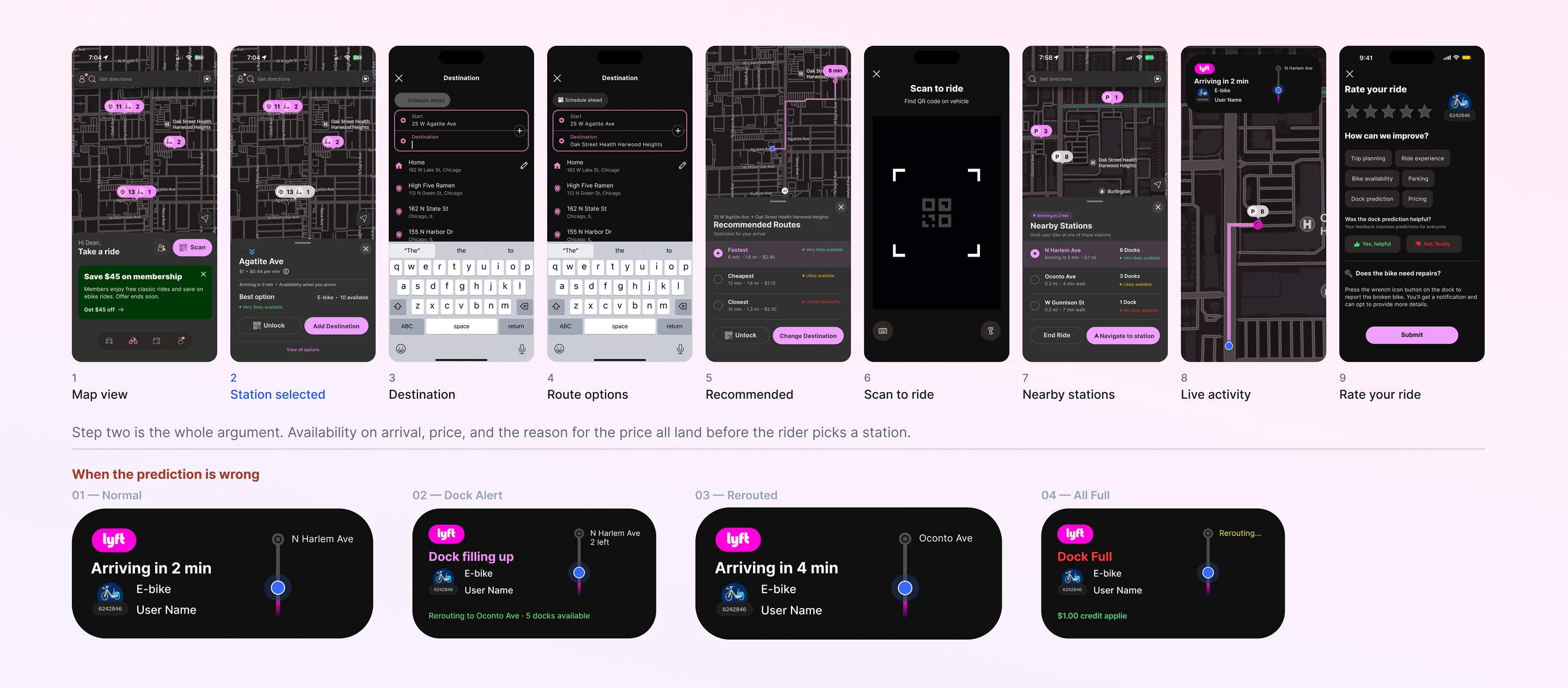
Once a rider adds a destination, three route options appear (Fastest, Cheapest, Closest), and each one shows how likely a dock will be open on arrival. The signal has three levels: very likely available, likely available, and limited availability. Because the rider decides before the bike unlocks, there's no reason to check the phone mid-ride.
03.
Live Activity mid-ride
Glance-only alerts via the iOS Dynamic Island.
If a destination dock starts filling up, the Live Activity updates with a passive alert. The rider doesn't open the app or tap anything. If the dock fills before they arrive, the system reroutes to the nearest alternative and issues a $1.00 credit for getting the prediction wrong. Owning the failure is what keeps riders trusting the prediction next time.
Research
Why redesign Lyft's bike experience?
I'm a Lyft bike user. The frustration started with one ride. I checked availability at home, found a station with bikes nearby, rode 15 minutes, and arrived to find every dock taken. I had to ride another 8 minutes to a station that wasn't full. The next week it happened again.
When the same frustration shows up over and over, it's worth treating as a signal instead of bad luck. So I mapped the full ride flow, from the station check at home to the bike unlock to the moment of arrival, and looked for the points where Lyft's existing infrastructure could have caught the failure.
What I found changed how I thought about the project. Lyft already has the data. It just doesn't show it to riders.
What Lyft already operates internally
I looked at how Lyft manages its bike-share network on the operations side. Four systems stood out. AirControl gives ops teams real-time station monitoring. Bike Angels is a rider-facing program that pays people for rebalancing trips ($3K a month for top users, per Bloomberg). Internal demand-prediction algorithms forecast dock availability with measurable accuracy. And the iOS Live Activities API can push passive notifications during a ride without making the rider touch the phone. Three of these four were already user-facing in some form, but none of them showed predicted availability before a ride, and none of them talked to each other in the rider flow.
Lyft's internal tools are a tell. AirControl and Bike Angels exist to manage a network whose behavior couldn't be steered through the rider-facing product. When a company builds tooling that operates around its primary product, that's usually a sign the primary product has a gap.
Where the trust gap shows up
"I'd check availability at home, ride 15 minutes, and find all docks taken. Repeatedly."
— Personal ride log, the design brief in one sentence
I mapped the user journey from intent-to-ride to post-ride and identified where prediction information was needed but absent. The biggest gap was at station selection: riders choose a starting station with no information about whether the destination dock will be available when they arrive. The decision to ride is made with incomplete data, and there's no way to recover mid-ride if conditions change.
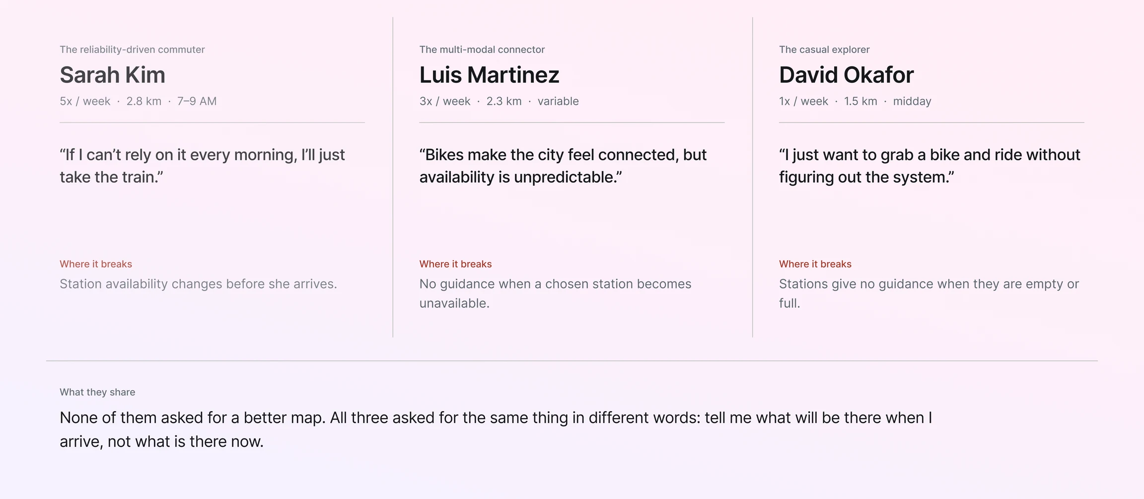
I documented three personas around different rider contexts: a reliability-driven commuter, a multi-modal navigator combining bikes with transit, and an occasional explorer. All three needed dock availability prediction before unlocking the bike, and none had it.
The same pattern surfaced on the operations side. Dock imbalance (too many bikes at one station, too few at another) is a daily problem that Lyft solves with trucks. NYC Comptroller data shows rebalancing moves dropped 80% from 2014–2022, but the underlying imbalance is still being addressed primarily through manual logistics rather than rider behavior.
Personal ride logging · journey mapping · 3 user personas · dock network health model · review of Lyft operational tools
Three findings that defined the brief
Rider-side prediction doesn't exist in the current product. Every ride is a bet on whether a dock will be open
Lyft has the prediction infrastructure but treats it as an operations-only resource
The operations-side fixes (trucks, Bike Angels) are responses to a UX gap. Riders can't make the decisions that would prevent the imbalance in the first place
Every dock decision has to happen before the ride starts. Active phone use while cycling is a safety constraint, not a design preference
Personas
Three rider contexts shaped the design: a reliability-driven commuter, a multi-modal navigator who chains bikes with transit, and an occasional explorer who rides without a system in their head. They all land on the same need at station selection, which is some signal of whether the destination dock will actually take their bike. Where they differ is how each one weighs price against time against certainty.
Design Goals
Three goals shaped the design. First, show dock prediction before the ride starts so riders choose a station with full information. Second, guarantee that the ride can be completed through a safety net that adapts to changing conditions mid-ride without making the rider touch the phone. Third, cut dock imbalance through rider behavior instead of truck redistribution, by lining up rider incentives with what the network actually needs. One constraint cuts across all three: every dock-related decision has to happen before the ride begins.
Design
The research established that this is a UX surfacing problem, not a technology problem. The fix doesn't require new prediction algorithms. Lyft already has them. It requires the existing infrastructure to be honest about what it knows and to expose that knowledge in the rider flow at the moment of decision.
Reframing the brief
The initial framing I started with was 'add dock availability info to the ride flow.' That treats the problem as a missing screen or a missing notification, a feature gap.
After the research, I reframed it as 'surface Lyft's existing infrastructure as user-facing UX.' That's a different design problem with a different solution space. If the brief is 'add info,' the design response is to wedge a status indicator somewhere. If the brief is 'surface infrastructure,' the design response is to look at every existing internal tool and ask where it should live in the rider flow.
The reframe was the most important contribution of the research phase. Every design decision downstream, including rejecting two initially obvious directions, followed from it.
Two Directions Rejected
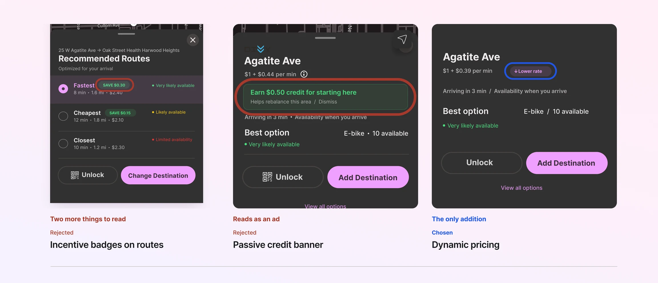
I explored three ways to surface dock prediction. Each one traded off visibility, behavior change, and complexity differently. The two I rejected are worth showing, because they look perfectly reasonable on paper.
Technical feasibility
All three worked within Lyft's existing infrastructure, so the choice wasn't technical. It came down to which approach would actually change rider behavior without piling more onto an already-busy comparison screen.
Alternative 01
Explicit incentive badges
'Save $0.30' badges layered onto dock options, putting financial incentive directly on the route selection screen.
PROS
Clear value proposition
Riders immediately understand the savings
CONS
Information overload on dock selection. Riders are already processing three options plus time and distance
Adds another visual element to a screen that's already busy
Badge fatigue from other apps means financial badges get tuned out anyway
Alternative 02
Passive banner notifications
'Earn $0.50 credit for starting here.' Surface rebalancing incentives through a dismissible banner near the station selection.
PROS
Low implementation cost
Doesn't change the existing UI structure
CONS
Banners are easy to dismiss or ignore
Reads like an ad, not a system message
Doesn't tap into the comparison riders already do. They naturally compare price and time, but they don't read banners while doing it
Direction 03
CHOSENDynamic pricing in existing UI
Per-minute rate adjusts by station supply and demand. The price riders already compare becomes the incentive. No badges, no banners.
PROS
No information overload, since it uses data riders already process
Taps into the comparison riders already make
Backed by published research: +300% revenue, -76% rebalancing cost vs fixed pricing (PMC, 2025)
Works within existing infrastructure. The pricing logic is on the backend, and the only visible change is the rate
CONS
Requires pricing-logic adjustments on the backend
Riders may not notice small price differences without prompting
Why I moved forward with this direction
Neither rejected direction actually changed behavior. Badges added noise. Banners got ignored. The chosen direction puts the incentive inside a number riders already compare, so there's no new UI to learn and no new behavior to adopt, and it's backed by published research on departure-side pricing (+300% revenue, -76% rebalancing cost versus fixed pricing).
Why departure-side pricing, not destination-side
Once dynamic pricing was the direction, the next question was where to apply it. The intuitive answer is destination-side: charge more to dock at understocked stations and less at overstocked ones, so riders go where Lyft needs the bikes.
I rejected that. Destination-side pricing makes the financial decision happen at the wrong moment. Riders have already committed to a route and the bike is already moving. Asking them to reroute mid-ride to save $0.30 is exactly the kind of active phone use the safety constraint forbids.
Departure-side pricing solves both problems at once. Overstocked stations have bikes sitting idle (Lyft wants them gone) and full docks at the receiving end (Lyft wants the space cleared). Cheaper departures from overstocked stations clear space for incoming riders and reduce truck redistribution. One price change, two problems solved, zero new infrastructure.
Key design decisions
Four decisions shaped the final design. Each was a direct response to the rider-side constraint that all dock-related decisions happen before the ride begins.
Pink pill for pricing, not green
Green is reserved for availability (a green dot means a bike is available). Pink is the Lyft brand color and gets used only for pricing. Keeping them separate stops riders from confusing 'is the bike available?' with 'how much does it cost?'
Removed Nearby Stations from the ride flow
Showing dock options mid-ride is a safety problem. It invites the rider to use the phone while cycling. I replaced the Nearby Stations feature with a passive Live Activity in the iOS Dynamic Island, which surfaces a dock-filling alert without the rider opening the app.
Dynamic pricing over incentive badges
A 'Save $0.30' badge adds a fifth visual element to a screen that's already crowded. The price itself, sitting in the data riders already read, is the incentive. No extra UI, and it rides on comparison behavior riders already do.
$1.00 credit when the prediction fails
If the system reroutes a rider because the predicted dock filled up, it issues a $1.00 credit automatically. This is a trust mechanism. A rider who gets burned once won't trust the prediction again unless the system owns the mistake and absorbs the cost of it.
Direction rejected
I considered making destination dock availability a hard requirement: refuse to unlock the bike unless a dock could be reserved in advance. I rejected it because it would have killed the casual ride, which is where most Lyft bike trips actually live. Someone grabbing a bike for a 6-minute trip to the store doesn't have a destination dock in mind. Forcing that choice up front would break the spontaneity that makes bike-share work in the first place.
Dynamic pricing in existing UI
The final design adds one mechanism the rider-facing product was missing: a price signal that reflects network health. Every other change in the design flows from this: the Live Activity, the rerouting, the $1.00 credit. The price signal itself reuses infrastructure Lyft already operates internally.
Three-tier dynamic pricing
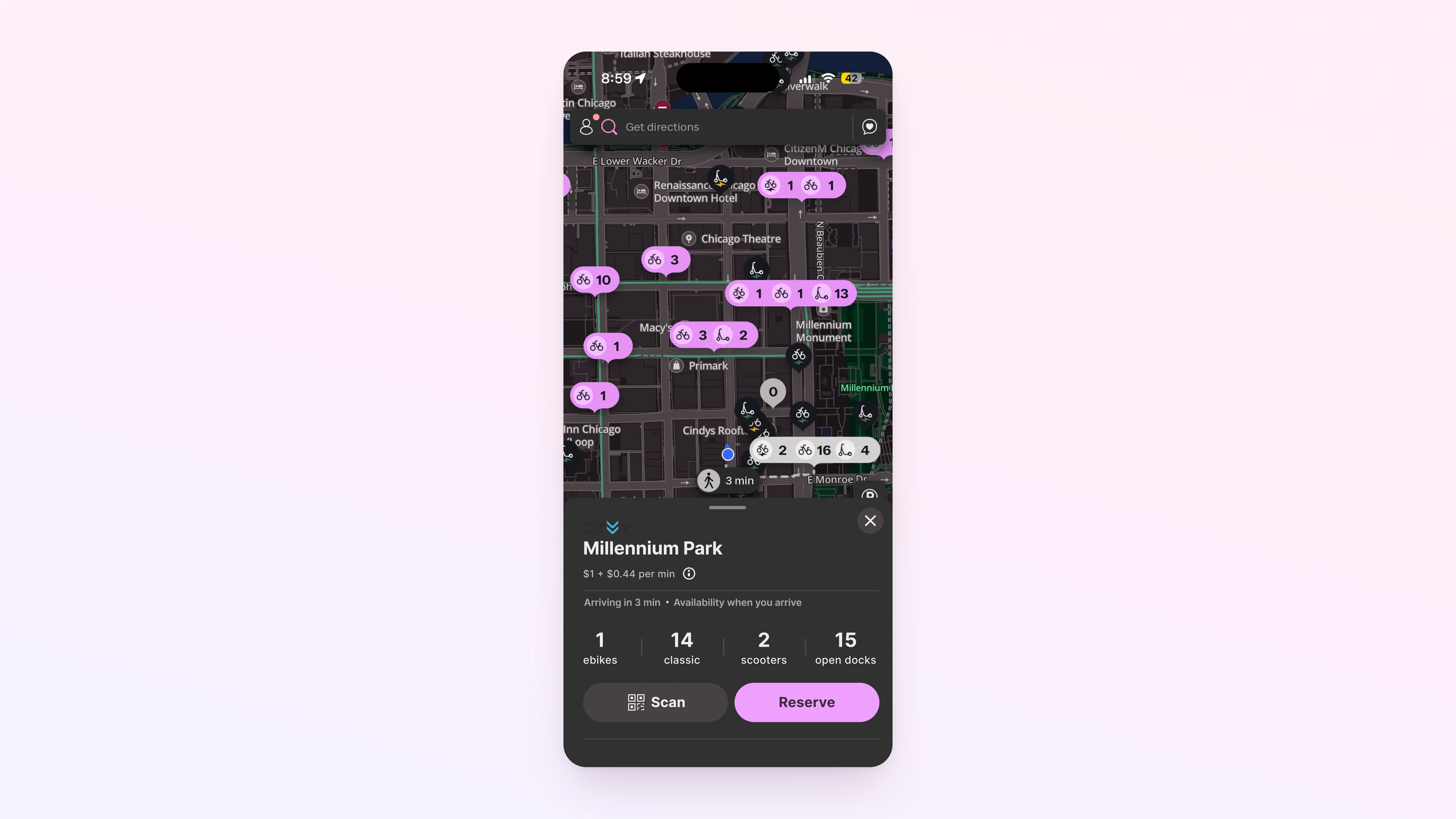
Overstock (75% or more bikes): $0.39/min, to encourage clearing the station. Normal (25 to 74%): $0.44/min, the standard rate with no nudge. Understock (under 25%): $0.49/min, to protect what's left. The price is set on the backend and applied at unlock. Riders see the rate label ('Lower rate' or 'Higher rate') on the station card.
Pre-ride dock prediction
After adding a destination, riders see three route options (Fastest, Cheapest, Closest), each with a predicted dock availability badge at the arrival station. The badge has three states: Very likely, Likely, and Limited availability. All three options can be compared at once, with no extra taps.
Live Activity mid-ride
The iOS Dynamic Island shows ride state in four phases: Normal ('Arriving in 2 min'), Dock Alert ('Dock filling up'), Rerouted ('Arriving in 4 min, follow new route'), and All Full (alternative station plus a $1.00 credit). It's glance-only, with no app to open and nothing to tap unless the rider wants to override the reroute.
Departure-side incentive design
All the pricing nudges live at the start of the ride, not the end. That puts the financial decision at the moment the rider is already comparing options, before the bike is unlocked. After unlock, the only Live Activity interaction is acknowledging a state change.


Usability Testing
Round 1
The Test
First Maze test on this project: a structured validation of the dynamic pricing direction and the dock prediction display. Round 2 is in progress.
PARTICIPANTS
8 participants across two task flows (Plan Your Ride: n=8 · Compare Stations: n=6 · Trust + Ease: n=4)
METHOD
Maze · 15 blocks · 2 prototype task flows · opinion scales · open response · 5-second tests
What We Found, and What We Changed
Each finding produced a specific refinement. The two-column structure below pairs the evidence with the design response.
FINDING 01
45% misclick rate on dock selection
EVIDENCE
Task 1 had a 45% misclick rate even though everyone eventually succeeded. Participants got to the goal, but with measurable friction along the way, which means the tap targets and visual affordances on the dock selection screen need work.
WHAT WE CHANGED
Increase the tap target size on the dock option cards and make it clearer which part of each option is interactive. Tested in Round 2.
WHY THIS FIX
Eventual success hides an affordance failure. A 45% misclick rate would mean real frustration in production even when the funnel completes, so I want it fixed before scaling the testing.
FINDING 02
Dynamic pricing validated by behavior, not just opinion
EVIDENCE
When asked what influenced station choice most, 50% said price per minute, 33% said the 'Lower rate' / 'Higher rate' label, and 17% said location or convenience. 67% noticed the price difference between stations without being prompted.
WHAT WE CHANGED
Direction confirmed. The rate label is doing real work, so I'll keep it alongside the explicit per-minute price rather than picking one over the other. No changes to the pricing mechanism in V2.
WHY THIS FIX
This was the central hypothesis of the whole design. The data shows that price embedded in the existing comparison is enough on its own, which confirms the call to reject explicit badges and banners.
FINDING 03
'Predicted 8 → Actual 6' split comprehension
EVIDENCE
Half the participants read the predicted-vs-actual display correctly. The other half misread it. One took it as walking-speed prediction variance, another as the number of riders currently trying to unlock bikes.
WHAT WE CHANGED
Redesign the prediction display in V2 and lean less on the '→' notation. Test simpler framings like 'Expected: 6 docks' or 'Likely 4 to 8 docks' with a confidence band.
WHY THIS FIX
A comprehension split means the display is doing different things for different riders. Trust needs everyone reading it the same way, so this is the highest-priority V2 fix.
FINDING 04
Information density flagged repeatedly in open response
EVIDENCE
Participant feedback: 'There were times when there was a lot of separate text boxes with different information which made it somewhat difficult to focus on one thing.' Another: 'There was still too much info. If I was seeking for only docks it should be more direct.'
WHAT WE CHANGED
Consolidate the station card hierarchy in V2 and cut the number of separate text containers. Test progressive disclosure for secondary information like the per-minute breakdown, predicted dock count, and route comparison.
WHY THIS FIX
When several participants independently flag the same density problem, it's the design's fault, not theirs. The cognitive load is real and it will only compound in production.
Where This Led
Round 1 confirmed the central hypothesis. Dynamic pricing in the existing UI changed behavior measurably, with 83% of station choice influenced by the price signal. It also surfaced three things to fix: affordance on dock selection, clarity on the prediction display, and overall information density. Round 2 is in progress with the refined design.
WHAT THIS CHANGED
The project started from my own frustration, but frustration is only a signal until you do something with it. When the same problem keeps hitting the same rider, it's worth treating as a system failure instead of bad luck. The Maze test was where I turned that signal into evidence other people could actually evaluate.
Outcome
No new technology needed.
Maze remote usability testing · 8 participants Round 1 · 15 blocks · 2 task flows · Round 2 targeting 10–15 participants
Two reframes mattered more than any individual screen. Existing tools are research artifacts — AirControl and Bike Angels exist because the primary product has a UX gap. Internal workarounds are diagnostic for primary product failure. And the brief itself is a design decision — changing the scope from 'add dock info' to 'surface existing infrastructure as UX' was the most important contribution of the project, more than any pixel.

Further Steps
Continue Round 2 Maze testing
Target 10–15 participants for Round 2 with the refined prototype. Same two task flows, same opinion scales, but with the prediction display simplified and dock selection affordance improved.
Specific targets: misclick rate below 25% on Task 1, comprehension on the prediction display above 80%, dock confidence rating maintained at 4.4+.
A/B test the pricing threshold
The current model triggers Overstock pricing at 75% capacity. Published bike-share research uses both 75% and 80% as thresholds. Neither is conclusively better, and the difference matters for how well the pricing lines up with rebalancing behavior.
An A/B test on the threshold would surface which value drives more rebalancing-aligned behavior without making the price differences feel arbitrary to riders.
Live Activity-only flow
Round 1 confirmed that the Nearby Stations panel during the ride is a leftover from earlier exploration and adds nothing to the active-ride experience. The next iteration removes it entirely, leaving only the Live Activity as the mid-ride interface.
This aligns the design with the original safety constraint: no active phone use during cycling. The Live Activity is glance-only by design; the Nearby Stations panel invites interaction.
Destination-side dynamic pricing
Departure-side pricing handles one half of the imbalance equation, which is clearing overstocked stations. Destination-side pricing could handle the other half by adjusting dock-reservation fees based on how full the receiving station is.
This was deliberately out of scope for Round 1 because mid-ride financial decisions violate the safety constraint. A future version could surface destination-side pricing at the pre-ride choice (so the decision still happens before the bike unlocks), letting riders pay slightly more to dock at understocked stations.
Station Reliability Score
Some stations are more predictable than others. Older docks with stable usage patterns produce accurate forecasts, while newer or seasonal stations don't. A per-station Reliability Score would let riders tell a high-confidence prediction apart from a best-guess one before they unlock.
This is the natural extension of the Dock Network Health Model documented in Figma. Building the score requires historical prediction-vs-actual data from AirControl, which exists internally but hasn't been exposed as a rider-facing signal.
What I Learned
Existing tools are a tell
AirControl and Bike Angels are workarounds for a UX problem. Lyft built them because the rider-facing product couldn't steer the network, so the network had to be managed from outside it. When a company builds tooling that operates around its primary product, that's usually a sign the primary product has a gap. The most useful question I now ask at the start of a project is what the operations team is using that the rider-facing product can't do.
Reframing the brief is itself a design decision
Changing the scope from 'add dock info to the ride flow' to 'surface existing infrastructure as UX' wasn't a small adjustment. It changed what I was solving for, how I'd measure success, and which directions were even worth exploring. Two approaches that looked obvious at the start got rejected once the brief shifted. The reframing mattered more than any single screen I designed, and it's the part of the project I'd point to first.
Personal frustration is research, but only after you treat it as data
This started because I personally got burned by dock unavailability. On its own that's an anecdote, not research. It turned into research the moment I stopped riding around the problem and started logging it, mapping the journey, and looking for the systemic cause. Frustration you treat as data becomes a brief. Frustration you treat as bad luck stays frustration.


