Biasly Mobile App

Faster recognition

9s → 3s median time-to-identify (n=12)

78%

Accuracy

Up from 31%, same task, different layout (n=12)

60%

Drop in missed indicators

Observer-coded overlooked bias data (n=12)

Mobile2025

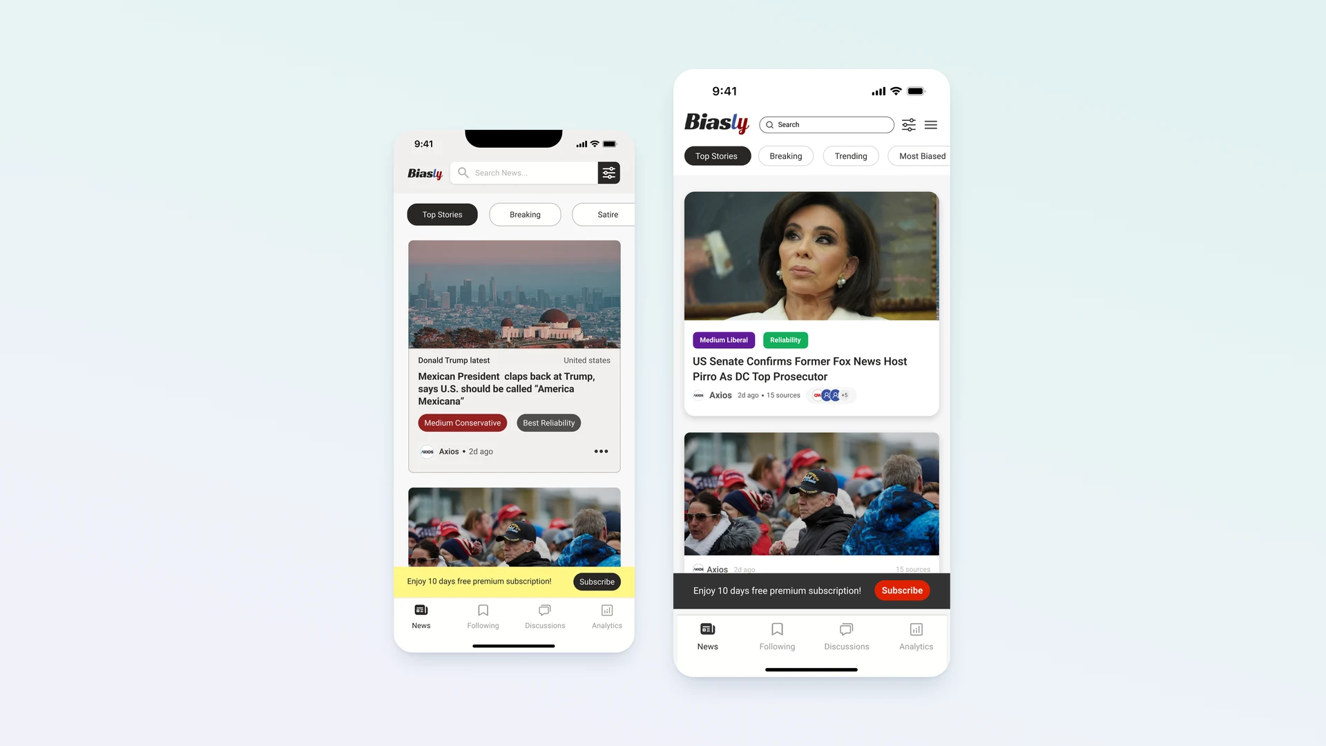
Biasly helps users understand political bias before engaging with content. The feed made that context easy to miss.

Role

Product Design Intern

Team

PM, 2 Engineers

Timeline

3 months

Tools

Figma, Maze, Notion

Overview


Problem

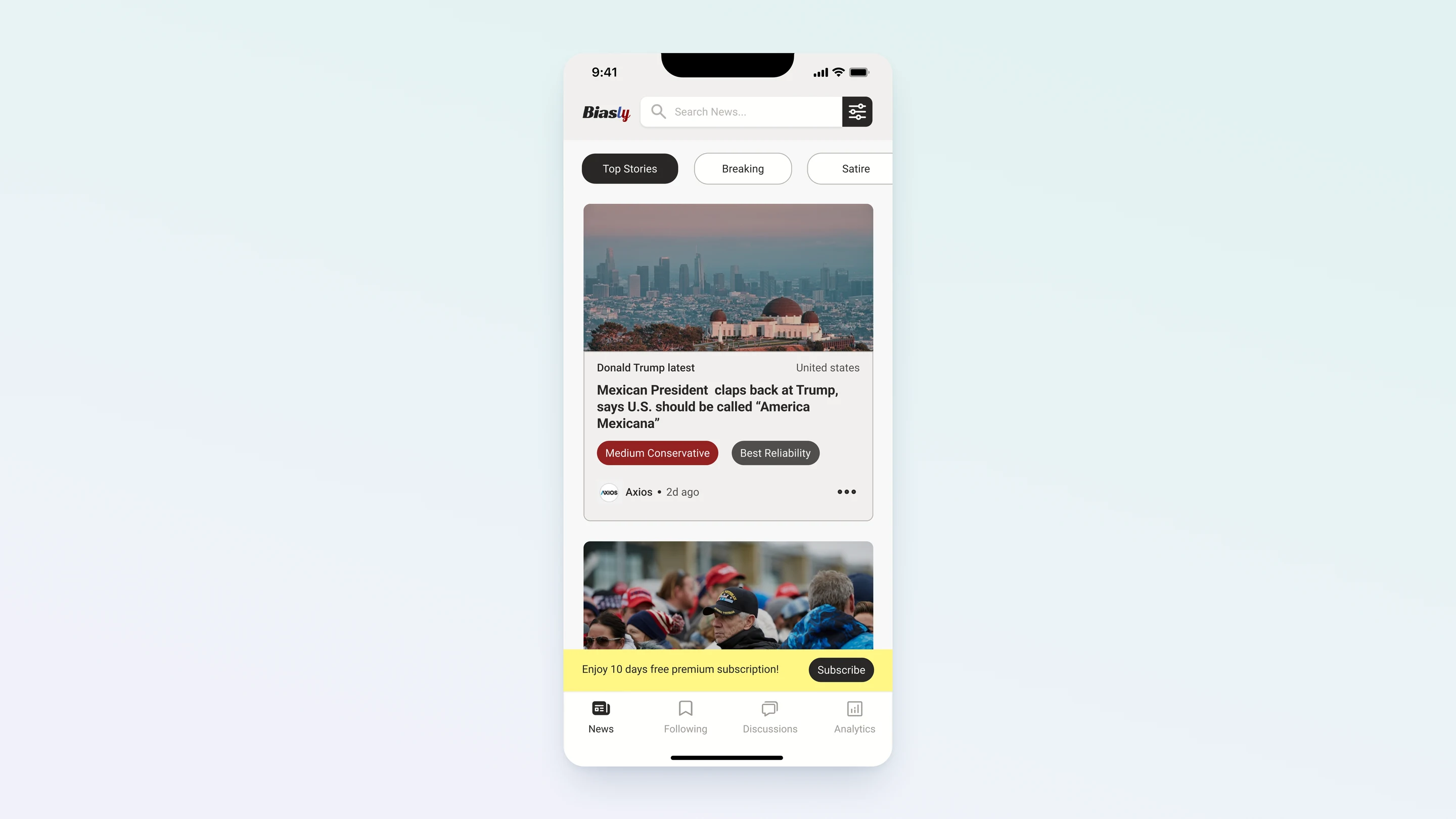
Casual news readers who use Biasly to stay politically informed often find themselves reacting to headlines before ever registering bias context beneath them. The bias indicator existed, but It just appeared too late. By the time users reached it, they had already formed an opinion.

1.

Bias indicators appeared below the primary scan path and were frequently missed

2.

Text labels communicated category only, not direction or strength at a glance

3.

Large article images dominated the card, leaving bias information visually secondary

Before
Before

The Solution

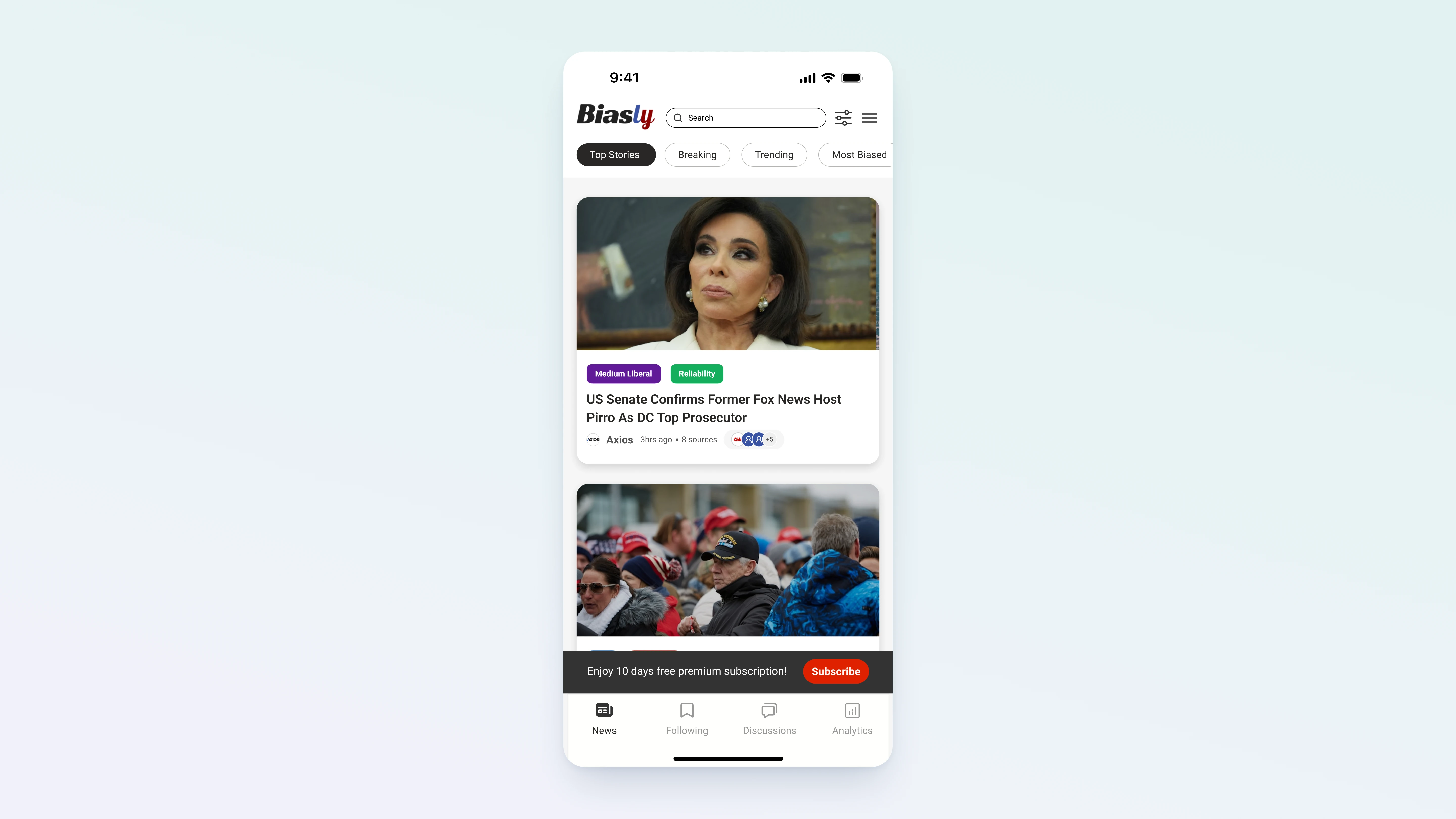
I redesigned the mobile news feed to place bias context at the top of every card, anchored before the headline. A visual spectrum replaced text labels, encoding direction and intensity at scan speed. Image size was reduced to rebalance the visual hierarchy in favor of the information the product was built to surface.

Bias Before the Headline

01.

Bias Before the Headline

Political context appears before users form an opinion.

The redesigned card anchors bias at the top, next to the source name. Users see direction and intensity before reading a single word of the headline, shifting the moment of awareness from after-the-fact to before the first impression.

02.

Instantly Read the Spectrum

The best photo is already picked for you. No reading required.

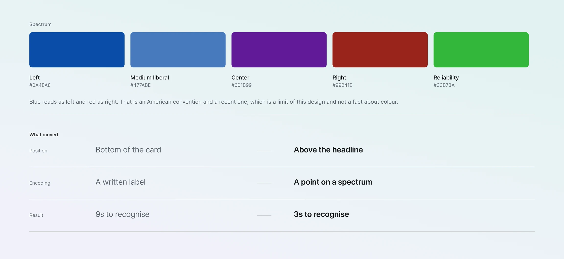
A left-to-right color-coded spectrum replaces the vague text label. Blue for Left, Purple for Center, Red for Right. The position and intensity of the fill communicates both direction and strength simultaneously, the way a gauge communicates data, not a label.

You Stay in Control

03.

You Stay in Control

Tap any card to read the full article with full bias context intact.

The article view preserves the same bias encoding at the top of the page. Users who want to read a story have full context visible throughout, not just on the feed. The system stays consistent so the encoding becomes second nature.

Research


Why Redesign the Feed?

I use Biasly myself. As a user, I noticed that I'd often read a headline, form a reaction, and only then notice the bias tag at the bottom of the card, at which point I'd already processed the content through whatever lens I brought to it. The app was designed to change my behavior, but the layout was letting me off the hook.

As a designer, I wanted to understand whether this was a personal pattern or a systemic one. The product's value depends entirely on users engaging with bias context before they read. If the layout is preventing that, the app isn't delivering on its promise, regardless of how good the bias detection engine is.

I approached the research with one specific question: is the problem that users don't care about bias information, or that the design isn't giving them a chance to see it in time?

Competitive Landscape

I reviewed how other news apps handle political context and source labeling. AllSides and Ground News both surface bias information, but primarily at the article level, after the user has already clicked. None of the products I reviewed positioned bias metadata at the moment of feed browsing, before the headline is read.

No existing product intervenes at the moment users actually form impressions, which is during fast-scroll browsing, not after clicking into an article.

Defining What Users Actually Do

"I usually just read the headline. I didn't even see the bias tag."

— Maksym, 28, usability participant

I ran 12 moderated usability sessions with participants aged 22–45 who identified as regular news readers. The task was simple: browse the feed naturally for 3 minutes, then answer questions about the bias of articles they had seen.

The results were consistent: 69% of participants could not correctly identify the bias of articles they had spent time reading. When probed, almost all of them said the same thing — they hadn't noticed it. Not because they didn't care. The indicator never showed up at the right moment.

I asked participants to walk me through a session using think-aloud protocol. The pattern was immediate. Every participant followed the same path: headline → image → scroll. The bias tag at the bottom was processed, when it was processed at all, as an afterthought.

12 moderated sessions · 5-second exposure test · think-aloud protocol · n=12, aged 22–45

Key Research Findings

1.

69% of participants could not identify bias on articles they had spent time reading

2.

100% of participants began scanning at the top of each card

3.

The bias label was the last element registered in card scan order

4.

When told where to look, users found the bias information immediately useful

5.

No participant voluntarily scrolled back up to re-check bias after forming an impression

Personas

The primary user is a politically aware news reader who wants to be informed without being manipulated. They open the feed to get a fast read on the day, not to spend time evaluating each source. The anti-persona is a user who has already decided which sources to trust and has no interest in being challenged. The redesign is not for them.

Design Goals

Based on the research, I defined three goals for the redesign: (1) make bias context visible before users read the headline, (2) encode bias visually so it registers without requiring active reading, and (3) maintain the speed and scannability of the feed so the change doesn't create friction.

Design


The further I got into the research, the more it stopped feeling like a visibility problem. It wasn't that users couldn't see the indicator. It was that they saw it in the wrong order. That's when it clicked — the fix wasn't making the indicator bigger or bolder. It was when it showed up that mattered.

Where Should the Change Happen?

My first instinct was to move the bias tag higher on the card. But before committing to that, I asked whether the feed was the right surface at all. Could the problem be addressed through onboarding, article pages, or a dedicated bias dashboard instead?

I went back to the session recordings. Users who engaged most with bias information did so during feed browsing, not after clicking into articles. The feed is where impressions are formed and decisions are made about what to read. That's the intervention point. Changing any other surface leaves the core behavior untouched.

So the feed was the right place. The question was how much to change.

Design Alternatives

I explored three structural approaches to surfacing bias earlier in the scan path. Each made a different trade-off between visibility, disruption to existing patterns, and technical complexity.

Technical feasibility

I had access to the PM and two engineers for feedback on feasibility. The main technical constraint: any overlay or animation approach would require client-side state tracking that added complexity. A static position change, moving the bias element to the card header, was the cleanest implementation path and the most reliable behavior across scroll speeds.

Alternative 01

Floating overlay on scroll pause

A bias badge appears when the user pauses scrolling over a card, overlaid on the image.

PROS

+

No layout change required

+

Preserves existing card hierarchy

CONS

Dismissed as an ad within 1 second in every test session

Conditional visibility means users who scroll at constant speed never see it

Overlays can be trained out, structural position cannot

Alternative 02

Bias bar below headline

A thin color bar replaces the text label, positioned between the headline and the article body text.

PROS

+

Visual encoding improves on text label

+

Lower disruption to card layout

CONS

Still below the headline, users form impressions before reaching it

Thin bar is easy to overlook during fast scrolling

Does not solve the sequence problem

Bias bar below headline

Alternative 03

Bias anchored to card header

Bias pill and spectrum bar move to the top of the card, adjacent to the source name, before the headline.

PROS

+

Appears before the headline in every scan sequence

+

Cannot be skipped without seeing it

+

Consistent position across all cards builds pattern recognition

CONS

Requires image size reduction to maintain visual balance

More layout change than the other options

Bias anchored to card header

Why I moved forward with this direction

I developed Alternative 03 further. The floating overlay and the below-headline bar both left the core sequence problem unsolved, they were just moving the label to a marginally better position. Moving bias to the header was the only option that structurally guaranteed it would be seen before the headline.

An Unexpected Feedback Pattern

When I showed the header-positioned prototype to users, one piece of feedback surprised me. Two participants said they found the bias label distracting when it appeared before the headline for topics they already had strong opinions on. They didn't want to know the source's political leaning before deciding whether to read, they wanted to evaluate the headline first.

That was something I hadn't anticipated. The design I was building to increase bias awareness was creating friction for users who were already politically engaged. I had to decide: is the product for users who want to be more aware, or for users who already are?

I brought this back to the PM. The product's positioning is squarely around helping users become more aware of bias, not serving users who are already expert at it. The header position stays. But the finding influenced the onboarding copy, which now sets clearer expectations about how the feed works.

Key Design Decisions

I changed the order of what users see first. Everything else followed from that. Three decisions shaped how that played out in practice.

01

Move bias into the scan path

Bias information was placed at the top of the card, where users naturally begin scanning. This is not about visual preference, it is about sequence. If bias appears after the headline, users have already formed their first impression. The only way to change that is to intervene before it happens.

02

Encode information visually

A left-to-right spectrum communicates direction and intensity simultaneously without requiring the user to read and interpret text. At scroll speed, the difference between a text label and a visual encoding determines whether the information registers at all.

03

Rebalance visual hierarchy

Images were scaled from full-width banners to constrained thumbnails. This was not an aesthetic decision, it was the only way to give bias information enough visual weight to compete for attention when a large image is also present. The image reduction and the bias elevation are the same decision.

Direction rejected

I explored a floating overlay that appeared when users paused on a card. It was dismissed as an ad within one second in every test session. Users have been trained to ignore overlays. Structural position cannot be ignored the same way. The overlay direction was abandoned after three test sessions confirmed the pattern.

The Redesign

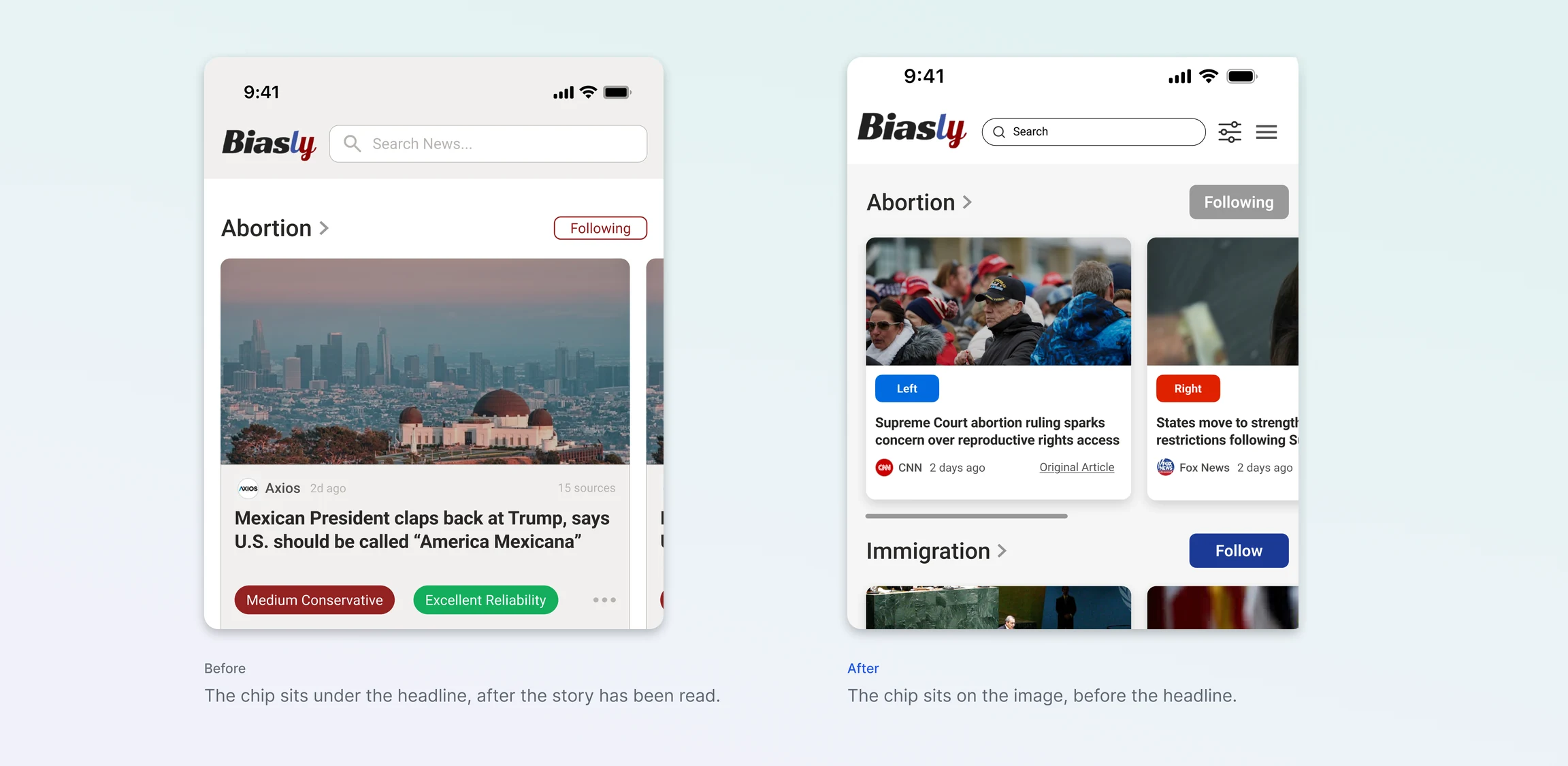
The redesigned feed makes one structural change: bias shows up before users even start reading the headline. Every other decision supports that.

01

Bias moved into the header

The bias pill was relocated from the bottom of the card to the header, positioned next to the source name. It is now the first element visible before the eye reaches the headline, restructuring the scan sequence rather than just repositioning a label.

02

Spectrum replaces text label

A color-coded left-to-right scale replaced the text label. Blue for Left, Purple for Center, Red for Right. The spectrum encodes direction and intensity simultaneously, without requiring the user to parse a text string. It works at scan speed.

03

Images reduced to thumbnails

Article images were scaled from full-width banners to constrained thumbnails. This gives bias data enough visual weight to register. The image reduction and the bias elevation are the same decision, a hierarchy rebalance.

04

Consistent encoding across surfaces

The same color encoding was applied to the article view and all detail surfaces. Once learned on the feed, the system requires no re-interpretation on any other surface. Consistency reduces cognitive load over time.

Before
Before
After
After

Outcome


Outcome

12 sessions · matched profile · 3-min exposure · 5-article recall · observer-coded

Post-redesign sessions used the same participants, same task, same duration. One variable: the layout. Users were now seeing bias before they reacted to the headline — and it showed in the numbers. The shift was not marginal. After handoff and QA, a version based on this design is rolling out with team refinements.

Faster recognition

9s → 3s median time-to-identify (n=12)

78%

Accuracy

Up from 31%, same task, different layout (n=12)

60%

Drop in missed indicators

Observer-coded overlooked bias data (n=12)

Final design

Future Steps


Onboarding the Color System

The spectrum bar assumes users understand that blue represents Left and red represents Right in the US political context. That assumption is not universal, it depends on familiarity with American political color coding, which is not shared globally and is relatively recent even domestically.

If I returned to this project, I would design a single annotated card that appears on first use, not a tutorial, just one card with labels explaining the spectrum. That one touchpoint would calibrate expectations without creating meaningful friction. I would test whether users who received this onboarding card demonstrated higher bias recognition accuracy in the first session.

Evaluating Behavioral Change Over Time

The usability testing I ran measured recognition accuracy in a controlled session. What I couldn't measure was whether the redesign actually changed reading behavior over time, whether users who browsed the redesigned feed were more likely to notice bias before forming opinions in their daily news consumption.

A longer-term study tracking reading behavior across sessions would answer this. Are users clicking into articles from sources with opposing bias more often? Are they flagging bias less (suggesting the indicator is doing its job) or more (suggesting increased engagement)? These longitudinal signals would tell me whether the redesign achieved its actual goal.

Extending the System to the Article View

The redesign currently applies to the feed card only. The article view still uses a smaller, text-based bias indicator. Extending the spectrum encoding to the article header, keeping the same visual language throughout the reading experience, would reinforce the system and maintain context as users move from scanning to reading.

What I Learned


Structural changes are harder to advocate for than visual ones

Moving the bias indicator from the bottom to the top of the card sounds like a small change. In practice, it required renegotiating the entire visual hierarchy of the card, which affected image treatment, source name positioning, and the overall balance of the design. Every stakeholder I showed it to had a reaction to the image reduction before they noticed the bias placement change. Advocating for a structural change means being prepared to defend every downstream consequence of it.

The unexpected finding was the most valuable output

The feedback from politically engaged users who found the upfront bias labeling distracting was more useful than the confirming data. It clarified who the product is actually for and influenced decisions beyond the feed redesign. The most important research outputs are often the ones that challenge the design direction, not the ones that confirm it.

Next →

FiPet