Skip to content
Sift · AI ticket triage

Sift · AI ticket triage

13

Screens, every state designed

Both AI modes, both ends of confidence, empty, loading, error, settings, dashboard, dark

41 of 100

How the AI states confidence

Frequency framing over raw percentages, backed by peer-reviewed calibration research

3

Gaps caught by self-audit, shipped as design

High-confidence explainability, learning-loop closure, priority ownership

Concept · B2B SaaS2026

AI ticket tools compete on how much they can automate. Agents don't need more automation, they need to see what the AI did, why, and how to take it back. Sift is a 13-screen concept built around that gap.

Role

Solo designer, end to end

Team

Self-directed concept project

Timeline

Jun – Aug 2026

Tools

Figma, FigJam, Maze

Overview


Problem

Every major support platform now ships AI triage. Zendesk, Intercom, and Freshdesk all classify incoming tickets automatically, and they market the same number: how much of the queue the AI handles without a human. Yet human-in-the-loop control and AI explainability keep appearing in industry research as unsolved design problems. The pattern underneath is consistent: agents are held accountable for what the AI files, but the products give them almost no visibility into why it decided, no honest signal of how sure it is, and no fast way to take an action back. The market is competing on automation power. Nobody is competing on the agent's experience of being in control of it.

1.

Confidence appears as raw percentages, a format people are consistently bad at calibrating

2.

Automated actions are hard to see and harder to reverse. Undo is buried or absent in the major tools

3.

Risk is treated as uniform. A product-feedback ticket and an account-deletion request get the same automation

The opposite bet: make the human faster

Sift is a concept for an AI ticket sorter built on the opposite bet: the product wins by making the human faster, not by making the human optional. The AI states its confidence in frequencies (right about 41 of 100 on tickets like this), routes anything below a per-category threshold to a person, locks sensitive categories to humans permanently, explains its reasoning at both ends of the confidence spectrum, and logs every automated action behind a one-tap undo. Thirteen screens cover the full reality of the product: AI on, AI off, high and low confidence, empty, loading, failure, settings, dashboard, and dark mode.

Confidence you can calibrate

01.

Confidence you can calibrate

Raw percentages lie to the gut. Frequencies don't.

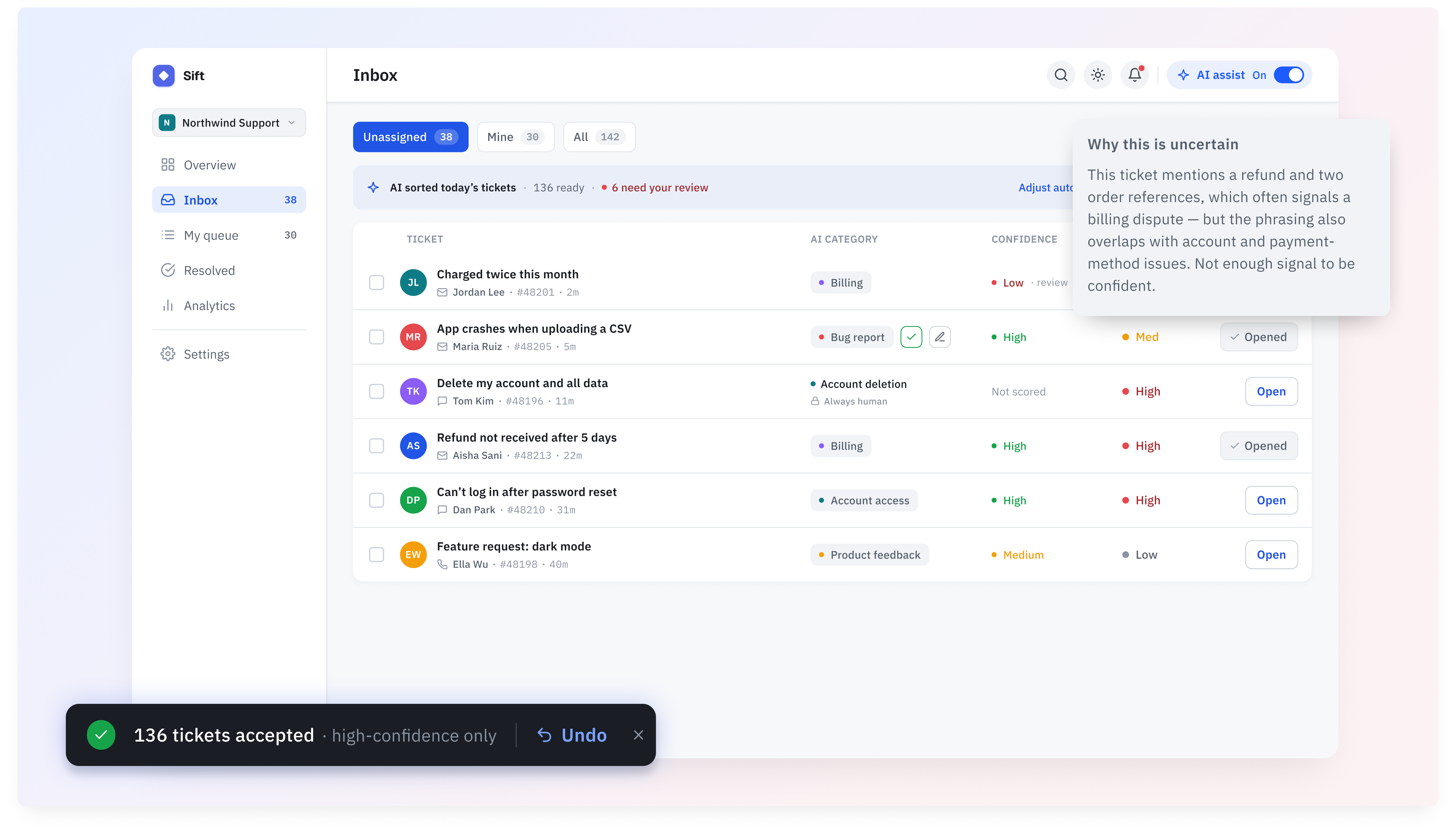
A 41% confidence score reads as a vague maybe. The same information written as 'right about 41 of 100 on tickets like this' reads as what it is: wrong more often than right, look closely. Research on uncertainty communication shows people calibrate frequency formats measurably better than probabilities, so every confidence number in Sift carries a frequency line next to it. It appears on the dashboard review queue, in the settings threshold, and on every ticket detail. The percentage stays for scanning. The sentence is what changes behavior.

A dial the agent owns, per category

02.

A dial the agent owns, per category

How much the AI does is a setting, not a policy handed down.

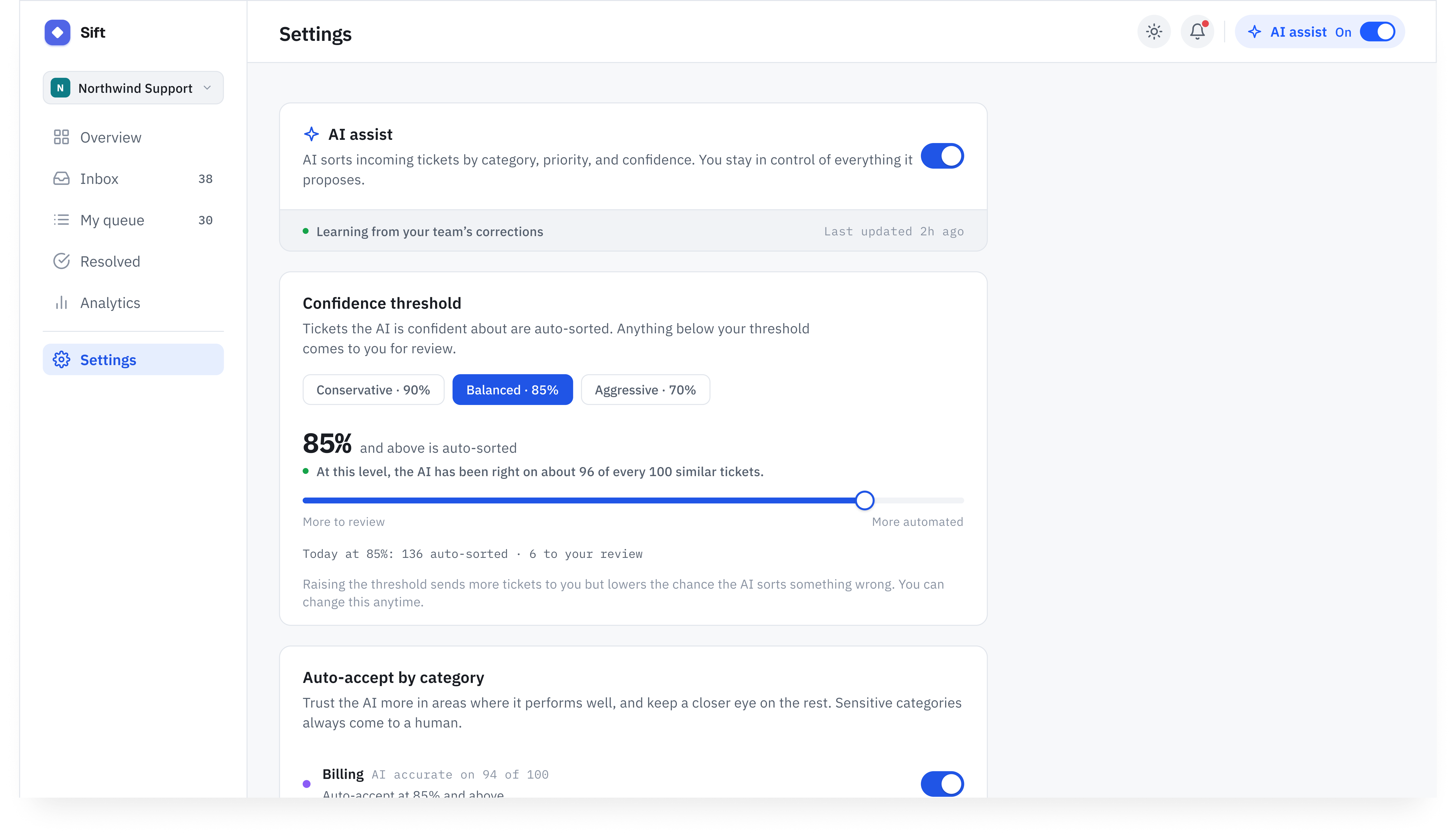
The confidence threshold is a slider: raise it and the AI auto-sorts only when it is very sure, lower it and more of the queue moves on its own. Each category gets its own rule, because risk is not uniform. Billing disputes can run at a different threshold than bug reports, and account deletion is locked to Always human, permanently, with the lock visible in the inbox itself, not just buried in settings. The slider copy uses the same frequency language, so the agent understands exactly what they are trading when they move it.

Friction only where mistakes are expensive

03.

Friction only where mistakes are expensive

One tap everywhere, except the moments you can't take back.

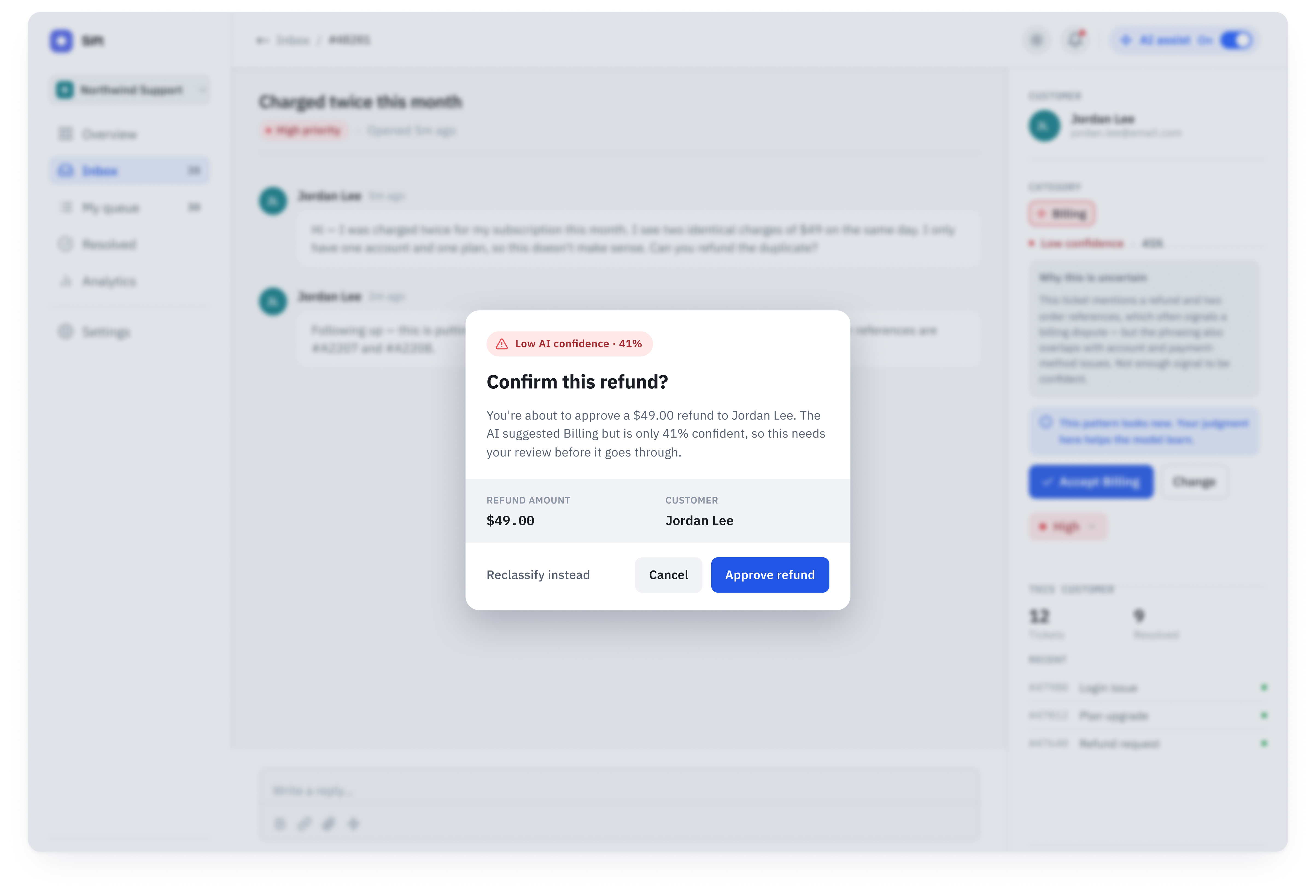
Approving a $49 refund on a suggestion the AI is 41% sure about is exactly the moment to slow someone down. A glass confirmation overlay interrupts the flow, restates the low confidence, shows the amount and the customer, and asks for an explicit decision. This is a cognitive forcing function, a pattern shown to reduce blind overreliance on AI suggestions. Everywhere else in the product, acting on the AI takes one tap. The friction is reserved for irreversibility.

01.

Confidence you can calibrate

Raw percentages lie to the gut. Frequencies don't.

Confidence you can calibrate

A 41% confidence score reads as a vague maybe. The same information written as 'right about 41 of 100 on tickets like this' reads as what it is: wrong more often than right, look closely. Research on uncertainty communication shows people calibrate frequency formats measurably better than probabilities, so every confidence number in Sift carries a frequency line next to it. It appears on the dashboard review queue, in the settings threshold, and on every ticket detail. The percentage stays for scanning. The sentence is what changes behavior.

02.

A dial the agent owns, per category

How much the AI does is a setting, not a policy handed down.

A dial the agent owns, per category

The confidence threshold is a slider: raise it and the AI auto-sorts only when it is very sure, lower it and more of the queue moves on its own. Each category gets its own rule, because risk is not uniform. Billing disputes can run at a different threshold than bug reports, and account deletion is locked to Always human, permanently, with the lock visible in the inbox itself, not just buried in settings. The slider copy uses the same frequency language, so the agent understands exactly what they are trading when they move it.

03.

Friction only where mistakes are expensive

One tap everywhere, except the moments you can't take back.

Friction only where mistakes are expensive

Approving a $49 refund on a suggestion the AI is 41% sure about is exactly the moment to slow someone down. A glass confirmation overlay interrupts the flow, restates the low confidence, shows the amount and the customer, and asks for an explicit decision. This is a cognitive forcing function, a pattern shown to reduce blind overreliance on AI suggestions. Everywhere else in the product, acting on the AI takes one tap. The friction is reserved for irreversibility.

Beyond the Home Screen


The thesis lives or dies in small moments. Four of them, from the screens the walkthrough above doesn't reach.

01. BULK ACTIONS

Undo as the price of speed

Undo as the price of speed

PROBLEM

Accepting 139 AI suggestions in one tap is efficient and slightly terrifying, which is the exact trade bulk automation asks people to make.

DECISION

The action fires immediately, then a toast holds the door open: 139 tickets accepted, high-confidence only, with one-tap Undo. The same actions land in the activity log for later.

OUTCOME

Speed without lock-in. The agent can be fast precisely because being wrong is cheap.

02. RISK POLICY IN THE INBOX

The row that refuses automation

The row that refuses automation

PROBLEM

A rule that lives only in settings is invisible at the moment of work, which is where risk policy actually matters.

DECISION

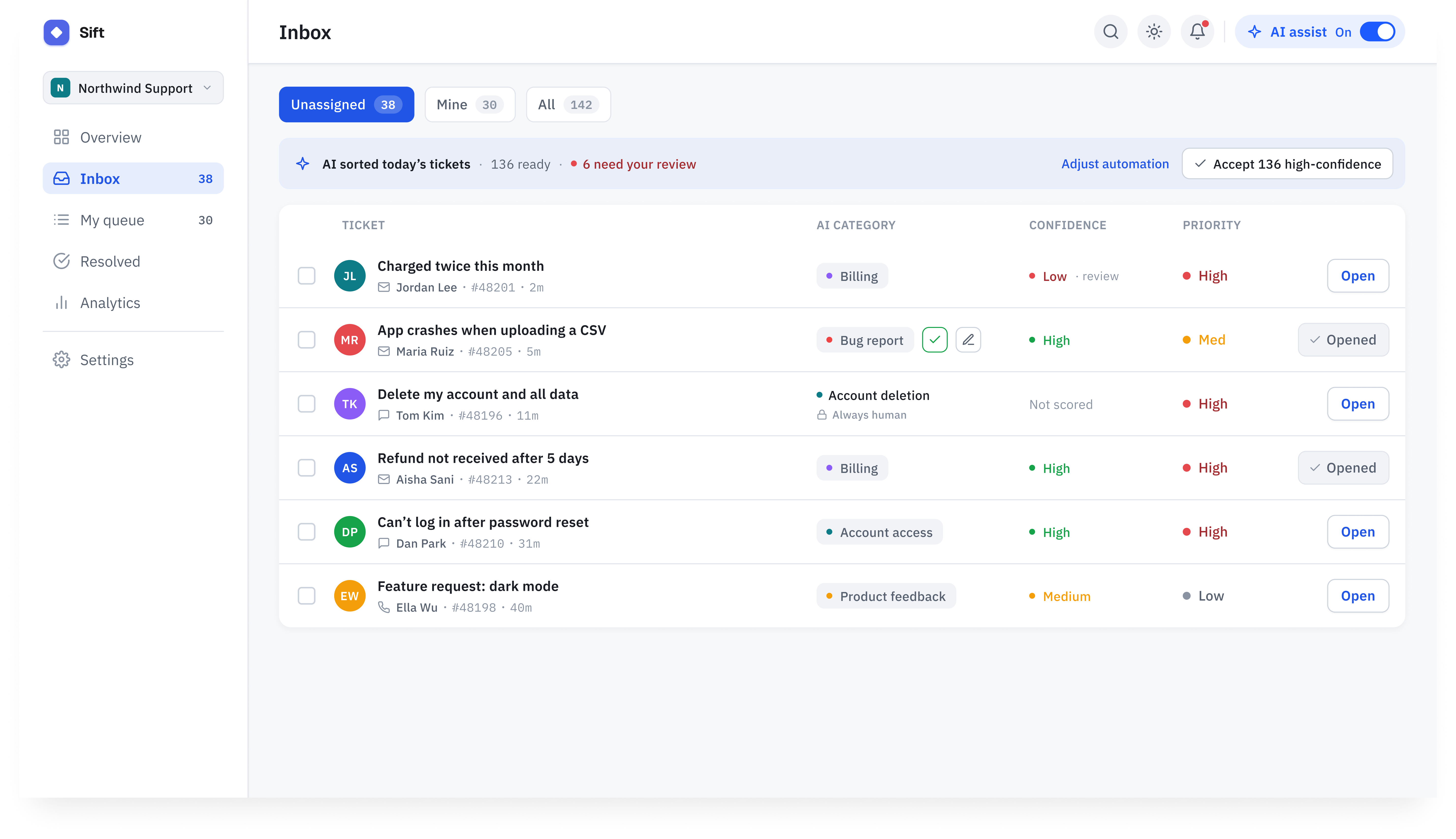
The account-deletion ticket carries its policy in the row itself: an Always human lock next to the category, and Not scored where confidence would be, because the AI genuinely didn't judge it.

OUTCOME

The AI's authority boundary is legible in the queue, not just in a settings page nobody rereads.

03. HIGH-CONFIDENCE DETAIL

Automated must never mean final

Automated must never mean final

PROBLEM

The 139 tickets the AI files on its own are exactly the ones nobody can interrogate in most tools.

DECISION

The auto-sorted detail carries a full Why the AI chose this card, an audit line noting when it acted and where it's logged, and an Auto-applied state that still ships with a Change button.

OUTCOME

Confidence becomes auditable. The agent can spot-check the AI's sure cases, which is where silent drift would otherwise live.

04. FAILURE STATE

The outage that isn't a work stoppage

The outage that isn't a work stoppage

PROBLEM

AI products are usually designed as if the model is always up, so an outage becomes a dead tool.

DECISION

When triage is unavailable, an amber banner says so plainly and hands the queue back: keep sorting manually, we'll resume when the service is back, with a visible retry.

OUTCOME

The failure state is an inconvenience instead of a stoppage, and it quietly proves the manual mode was designed for real.

Research


Why design this product at all?

The interesting design question of 2026 is not whether AI can classify things. It can, and every support tool proves it daily. The question is whether the people held accountable for the AI's output can understand it, calibrate it, and override it. I kept seeing the same gap between what AI products can do and what their interfaces let people trust.

I chose support triage as the ground to work this out because the stakes are concrete and the accountability is asymmetric. When the AI misfiles an account-deletion request as product feedback, the agent answers for it, not the model. That asymmetry is a design brief in one sentence.

This is a self-directed concept project, and I treated that as a constraint to design around rather than an excuse. No production data meant every major decision had to cite published evidence instead of taste, and it meant the research had to be graded honestly by how much I could trust it.

The market competes on automation power. Nobody competes on trust.

I audited how Zendesk, Intercom Fin, and Freshdesk present AI triage to the agents who live in these tools. All three lead with resolution volume: how much of the queue the AI closes or routes on its own. Confidence, when shown at all, appears as a raw score. Reversal paths exist but are slow and buried. Per-category risk control is thin. Vendor-reported resolution rates cluster around half of ticket volume, which means the hard half still lands on humans, working inside interfaces designed to celebrate the automated half.

Every major tool competes on automation power. Not one competes on the agent's experience of trusting and steering it. That gap is the product.

Evidence tiering instead of cherry-picking

Concept projects have a research credibility problem: it is easy to collect quotes that agree with the design you already wanted to make. To keep myself honest, I graded every source into three tiers before letting it influence a decision. Verified meant peer-reviewed or replicated findings. Directional meant a single credible study or strong practitioner consensus. Vendor claim meant marketing numbers, used only as signals of what companies believe, never as evidence of what works.

The tiering changed the design. The frequency-framing decision rests on Verified research about how people read uncertainty. The feedback-framing decision rests on a Directional finding, so the design treats it as a hypothesis to test rather than a settled fact. Resolution-rate numbers from vendors shaped my read of the market but never justified a screen.

In parallel I wrote a 30-minute discovery interview script for working support agents, deliberately free of embedded hypotheses, and started recruiting. The interviews run alongside usability testing, and the design is structured so their findings can move thresholds, copy, and defaults without breaking the system.

Secondary research with three-tier evidence grading · competitive audit of Zendesk, Intercom Fin, Freshdesk · 30-minute discovery interview script written, recruiting in progress

What the graded evidence said

1.

People consistently miscalibrate raw probabilities; frequency formats measurably improve judgment (Verified, peer-reviewed 2024)

2.

Cognitive forcing functions reduce blind acceptance of AI suggestions, at a small cost in speed (Verified)

3.

Asking users to rate AI answers can reduce trust in the product; framing input as contribution avoids the effect (Directional, single study, flagged for testing)

4.

Vendor-reported AI resolution rates cluster near half of volume, leaving the ambiguous half to humans (Vendor claim, treated as market signal only)

5.

B2B support agents work overwhelmingly on desktop, 68 to 83% across sources, which set the 1440px desktop format (Directional)

Personas

One persona, deliberately. Maya is the agent who answers for the AI's decisions, and the entire product is designed from her seat. Team leads and admins who set policy, review audit trails, and manage permissions are a real second surface, but scoping them out was the decision that let the agent experience go deep instead of wide. That boundary is documented as Layer B in the future steps, not forgotten.

THE AGENT WHO ANSWERS FOR THE AI

AI PORTRAIT

01 / THE AGENT WHO ANSWERS FOR THE AI

Maya Chen

Support agent · 142 open tickets today

"If it files something wrong, I'm the one who hears about it."

KEY NEEDS

  • See why the AI chose, not just what it chose
  • Take back any automated action in one tap
  • Decide how much the AI does, category by category

DESIGN IMPLICATION

Every AI action must be visible, explainable, and reversible from the agent's seat, without leaving the flow of work.

Design Goals

Three goals shaped every screen. First, make the AI's state legible at every moment: what it is about to do, what it is doing, and what it just did. Second, put the automation dial in the agent's hands, per category, with honest language about what each setting trades. Third, design the failure states with the same care as the happy path, because an AI product is judged on the day the model is wrong or down, not the day it works. One constraint cut across all three: this is a high-density desktop tool at 1440px, where an agent lives for eight hours, so restraint beats spectacle everywhere.

Design


The research kept pointing at moments rather than screens. Trust in an AI coworker doesn't break in general, it breaks at specific instants: the moment you wonder what it will do, the moment you can't tell what it's doing, and the moment you discover what it did and can't take it back. Most tools design only the middle moment. I mapped the screens to all three.

Where does trust actually break?

Before the AI acts, the question is what will it do with this. That moment lives in settings and thresholds: the agent deciding, per category, how confident the AI must be before it moves without asking. If that dial doesn't exist or isn't legible, trust never forms, it's just hope.

While the AI acts, the question is what is it doing right now. That moment lives in the status banner, the loading state with real progress, and the dashboard. Silence here reads as something being hidden.

After the AI acts, the question is what did it do and can I take it back. That moment lives in the activity log, the undo toast, and the explanation card on every classified ticket. This is where the major tools are thinnest, and where the accountability asymmetry bites hardest. The thirteen screens exist because each of these moments needed to be designed on purpose, including the ones where the AI is off, wrong, or down.

Three answers to one question: how much should the AI do on its own?

The core architecture decision wasn't visual. It was how much autonomy the AI gets, and every screen downstream inherits the answer. I worked through three architectures before committing.

Technical feasibility

All three are buildable on a modern classification stack. A production version needs per-category confidence scores and correction telemetry, both standard outputs of current models. The choice wasn't technical feasibility, it was which architecture produces trust at ticket volume instead of consuming it.

Alternative 01

Review everything

Every AI suggestion lands in an approval queue. Nothing moves until a human confirms it.

PROS

+

Maximum control, zero silent errors

+

Simple accountability story: a human approved everything

CONS

At 142 tickets a day, approval becomes rubber-stamping, which is overreliance wearing a safety costume

The agent's job degrades into clicking confirm, the exact replacement anxiety the product should be answering

Throws away the volume relief that justifies AI triage in the first place

Review everything

Alternative 02

Automate everything, undo after

The AI files every ticket on its own. The agent gets a complete activity log and a global undo.

PROS

+

Maximum speed, and the mental model fits in one sentence

+

Undo plus logging is honest about errors after the fact

CONS

Overreliance research points the wrong way: when everything is automatic, review atrophies

Silent errors in sensitive categories are unacceptable. An auto-processed account deletion is not an undo story, it's an incident

Trust never forms because the agent never participates in the decisions, only in the cleanup

Automate everything, undo after

Direction 03

CHOSEN

Confidence-routed, per category

The AI auto-sorts above a confidence threshold the agent sets per category, routes everything below it to human review, and never touches locked categories.

PROS

+

Automation where it's safe, human judgment exactly where it matters

+

The dial is per category, matching how risk actually varies

+

Confidence becomes a first-class UI concept, which forced the honest-communication work

+

Degrades gracefully: at threshold 100 it becomes architecture 01, so cautious teams can start there

CONS

The settings surface is more complex, and it has to be, which raised the bar on its design

The whole system depends on confidence being communicated honestly, a hard problem promoted to the center of the product

Confidence-routed, per category

Why I moved forward with this direction

The rejected architectures fail in mirrored ways. Review-everything consumes the human to protect the human. Automate-everything removes the human to serve the human. Confidence routing was the only architecture where speed and judgment coexist, and it converted the vague brief of 'build trust' into a concrete design program: make confidence legible, make the threshold ownable, make every action reversible.

The audit that produced a thirteenth screen

With twelve screens done, I ran two structured self-audits before calling the design finished. The first was a Nielsen heuristic evaluation of every screen. It found two real violations: the ticket-detail action buttons had drifted into three different visual treatments for same-rank actions, and the account-deletion row showed an unexplained empty confidence cell. Both got fixed, one with a neutral secondary button style, one with an explicit Not scored label. It also produced a false positive worth keeping: the Accept button label varies by context (Accept, Accept 139 high-confidence, Accept Billing), which I initially logged as inconsistency and then correctly reclassified as context adaptation. Auditing your own work only helps if you're willing to overrule your own findings.

The second audit mapped every research problem to its design answer and looked for orphans. It found three. High-confidence tickets were a black box: the reasoning card existed only on uncertain tickets, so the 139 tickets the AI filed automatically offered no way to ask why. The learning loop made a promise the interface never paid off: the product says your judgment helps the model learn, but nothing ever showed a correction changing anything. And priority had no owner: the AI clearly owned category, but nothing said who set priority.

All three gaps became design. A thirteenth screen, the high-confidence ticket detail, gives auto-sorted tickets a full 'Why the AI chose this' card and an Auto-applied state that still carries a Change button, because automated must never mean final. The dashboard accuracy card gained one green line, Billing accuracy up 3 pts since last month's corrections, closing the loop between the agent's work and the model's improvement. And a one-line caption under priority, set by your SLA rules, you can change it anytime, drew the boundary of the AI's authority in the interface itself: it suggests categories, it never touches priority.

None of this replaces user testing, and the case for that is below. But self-critique with named methods is what evidence discipline looks like when users aren't in the building yet, and it changed the shipped design three times.

Key Design Decisions

Four decisions carry the thesis. Each one traces to a graded piece of evidence, and each one shows up on multiple screens rather than living as a one-off feature.

01

Confidence in frequencies, not percentages

Every confidence number carries a frequency sentence: on tickets like this, the AI has been right about 41 of 100. Peer-reviewed work on uncertainty communication shows people calibrate frequencies far better than probabilities. The framing appears at every decision point, the dashboard review queue, the settings threshold, and both ticket details, so the agent's mental model of the AI's reliability is built from a format they can actually reason with.

02

Friction only where mistakes are expensive

Acting on the AI takes one tap everywhere except irreversible moments. Approving a refund on a low-confidence suggestion raises a glass confirmation that restates the uncertainty and the stakes. Cognitive forcing functions measurably reduce blind acceptance of AI output, and reserving them for irreversibility keeps the cost where the risk is instead of taxing every action.

03

Sensitive categories never leave human hands

Account deletion is locked to Always human. The AI does not classify it, so its confidence cell reads Not scored instead of pretending. Critically, the lock is visible in the inbox row itself, where the work happens, not only in a settings page nobody rereads. Risk policy that can't be seen at the moment of work is policy in name only.

04

Failure designed as carefully as success

Empty, loading, and error are full screens, not afterthoughts. The empty state says what the AI actually did today instead of celebrating vaguely. The loading state shows real progress, 64 of 142 classified. The error state's whole message is that the human can keep working: AI triage is temporarily unavailable, keep sorting manually, with a retry. An AI product earns trust on the day the model is down.

Direction rejected

I cut the standard feedback pattern, star ratings and thumbs on AI answers, before it reached hi-fi. A directional finding suggests asking users to grade the AI can reduce trust in the product, the interaction reframes the tool as a student you supervise for free. Sift replaces it with contribution framing at the moment of correction: this pattern looks new, your judgment here helps the model learn. The correction itself is the feedback. Whether that framing lands is one of the specific things Round 1 testing is designed to check, because the evidence grade here is Directional, not Verified.

The system

Thirteen screens at 1440px on one token system: a single cobalt accent, tinted neutrals, IBM Plex Sans for interface and IBM Plex Mono for data. Enterprise restraint was the aesthetic bet: an agent lives here eight hours a day, and the AI-forward products this competes with mostly signal intelligence with gradients and glow. Sift signals it with legibility.

01

Control has layers, not a switch

A global AI toggle sits in the header of every screen, the same position whether the AI is on or off. Below it: per-category thresholds in settings, Accept and Change on every ticket, an undo toast after bulk actions, and a live activity log on the dashboard. The agent can dial the AI from fully manual to mostly automatic without ever losing the ability to see and reverse what it did.

02

Explainability at both ends of confidence

The low-confidence detail explains why the AI is uncertain. The high-confidence detail explains why the AI was sure, and its Auto-applied state still carries a Change button. Most tools explain only when asking for help. Explaining when confident is what makes the confident cases auditable, and it's what turns 139 auto-sorted tickets from a black box into a reviewable decision trail.

03

States as a first-class row

Empty, loading, and error sit in the file as their own screen row, designed with the same fidelity as the dashboard. Each carries the thesis: the empty state reports honestly, the loading state shows true progress, the error state keeps the human productive while the AI is down.

04

Dark mode from the same tokens

The dark dashboard is generated by remapping the token system, 173 bound color styles, to a dark palette, not by hand-recoloring a copy. It proves the token architecture is real, and it ships the header's dark-mode button as a kept promise instead of a decorative control.

Outcome


Where it stands

Structured self-evaluation to date: Nielsen heuristic pass across 13 screens, problem-to-solution audit, AI-tell craft audit. User evidence: Maze Round 1 in progress, discovery interviews recruiting.

The system is complete and testable: thirteen screens covering every state of the product, a token architecture proven by the dark-mode remap, a FigJam user flow of the full decision loop, and a Maze plan aimed at the design's riskiest claims. Two structured self-audits already changed the design three times. What it doesn't have yet is user evidence, and the honest version of this page says so: Round 1 is in progress, and this section updates when the data lands.

13

Screens, every state designed

Both AI modes, both ends of confidence, empty, loading, error, settings, dashboard, dark

41 of 100

How the AI states confidence

Frequency framing over raw percentages, backed by peer-reviewed calibration research

3

Gaps caught by self-audit, shipped as design

High-confidence explainability, learning-loop closure, priority ownership

Final design

Future Steps


Let Round 1 argue with the thesis

The Maze plan is built to falsify the design's specific bets, not to collect praise. The frequency-framing comprehension check matters most: if people read 'right about 41 of 100' and still conclude the AI is usually right, the calibration centerpiece needs a new form, and that finding would be worth more than a clean pass.

The control rating and the open question are there to catch what the missions can't: whether the layered-control model produces an actual felt sense of being in charge, or just more switches.

Discovery interviews with working agents

The interview script exists and recruiting is in progress: 30 minutes, working support agents, no embedded hypotheses. The design's framing of the trust gap comes from graded secondary research, and practitioners will bend it. The threshold defaults, the category set, and the copy on the frequency lines are all built to move when they do.

A planned dashboard layer, richer team-level views on the overview screen, is deliberately gated behind these interviews rather than designed from assumption.

The team lead layer

Thresholds are policy, and in a real deployment policy has owners above the agent. Layer B covers the team lead and admin surface: threshold governance, audit views across agents, permission boundaries, and the reporting that makes the accuracy trend line accountable. It was scoped out deliberately so the agent seat could be designed completely, and it's the natural next surface.

A coded prototype for the moments static frames can't carry

Undo has a timing window, the loading state has real progress, and the glass confirmation has a rhythm that a static frame can only imply. The same lesson carried over from my FiPet work: when the remaining unknowns are behavioral, the honest next prototype is code. A React build of the inbox loop, accept, undo, error fallback, is the planned vehicle for Round 2.

What I Learned


Honesty is a set of design decisions, not a tone of voice

It's easy to say a product should be honest about its AI. It's specific work to decide what that means on each screen: a confidence sentence written in frequencies, a Not scored label where the AI didn't judge, an empty state that reports what actually happened, an error banner whose first message is that the human can keep working. Each of those is a decision someone could have skipped without anyone noticing at demo time. Honest AI products are built out of exactly the decisions that don't demo.

Self-critique is a method, but only with named instruments

Vibes-based self-review finds what you already suspect. Running a Nielsen pass and a problem-to-solution audit as formal steps found things I did not suspect: a thirteenth screen the system needed, a promise the interface never paid off, and a false positive I had to overrule myself on. On a solo concept project, structured self-critique is the difference between a portfolio piece and a decorated opinion. It also taught me where its limit is, which is exactly why the Maze plan targets the claims self-critique can't settle.

In 2026, craft includes not reading as machine-made

There's an irony in designing an AI product carefully enough that it doesn't look AI-generated, but recruiters now see a thousand generated dashboards a week and they've learned the tells. I audited for them directly: display type tightened to negative tracking instead of the default airy spacing, all 472 icons normalized to a single stroke-to-size ratio, label tracking unified to one value, spacing set by rhythm rather than uniform padding. None of it shows up in a feature list. All of it shows up in whether the work reads as decided or generated.

← Previous

Biasly Mobile App