FiPet shipped to the App Store without a single usability test. I led the redesign around a new 1v1 Quiz Battle feature, established a design system the whole team adopted, and ran the company's first usability test.
Overview
Problem
FiPet shipped to the App Store with no usability testing. Few downloads. Poor reviews. Users weren't coming back. The original design was too complex for the 8–15 audience it was built for, heavy gradients, ambiguous icons, a flow no one could follow on the first try. No one described the app as fun. The team had built a financial literacy product for kids and shipped it the way you'd ship enterprise software.
Heavy gradients and visual complexity that didn't fit a kids' app
Ambiguous custom icons users had to guess at
Confusing flow, users didn't know what to do next on first open
No fun factor, one interview participant described it as homework

The Solution
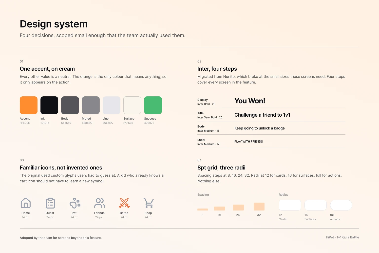
I led the redesign around a new feature the team aligned on in a company-wide meeting: 1v1 Quiz Battle. Sixty-second matches against a friend, competitive framing, learning happens inside play rather than before it. I built a design system around a single primary color (#FF8C2E), Inter typography, SVG line icons, and an 8pt grid, and the entire team adopted it for a broader app redesign beyond my feature. And I introduced usability testing as a default practice. The original ship had skipped it. This one didn't.
01.
A Reason to Open the App
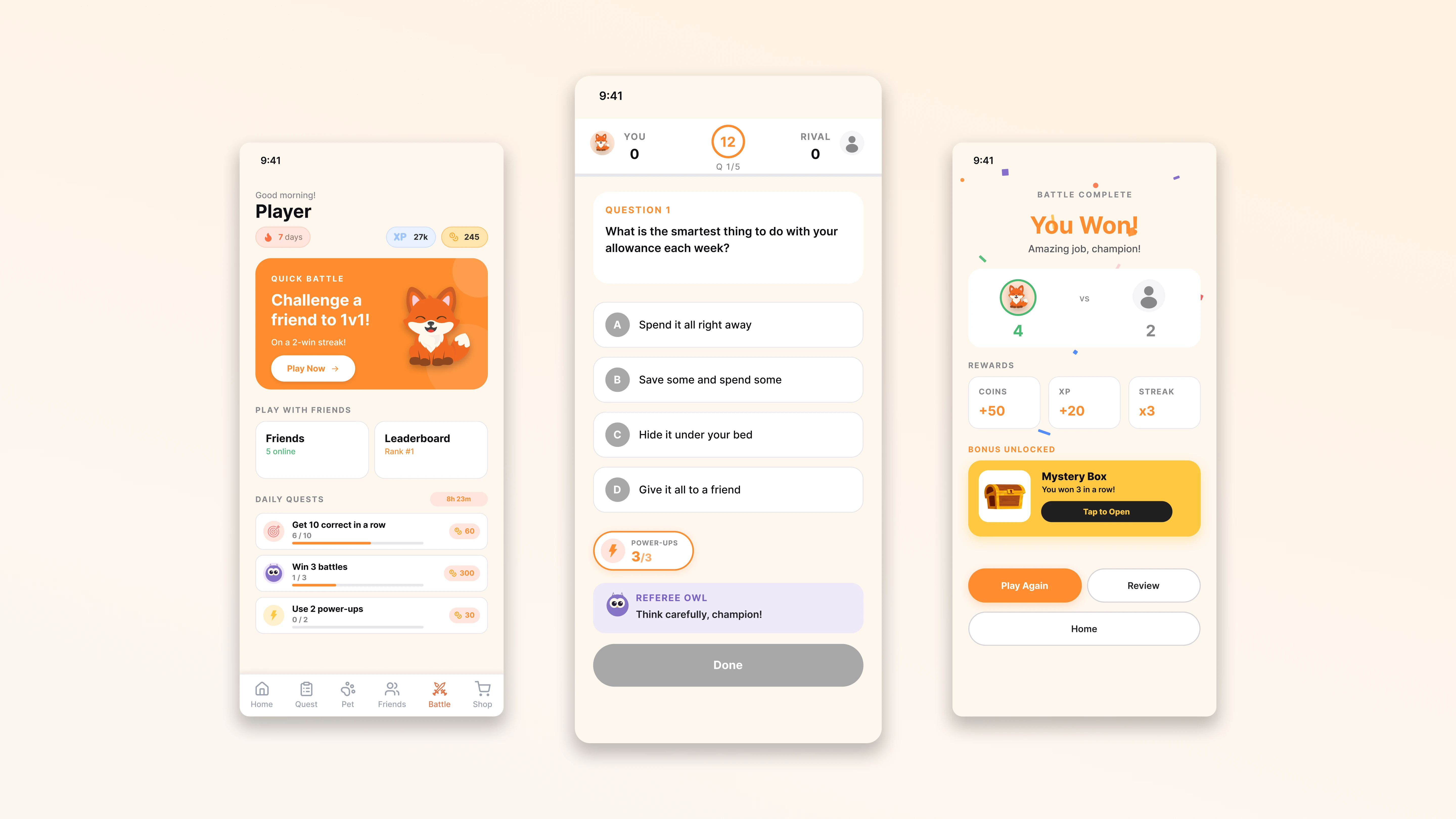
The home screen leads with a pending battle, not a menu.
The original FiPet opened to a lesson list, the default of an app built around content. The redesign opens to a Quick Battle card: challenge a friend to a 1v1 quiz in 60 seconds. Below it sits a win streak counter, friends online, and a leaderboard. The screen answers 'why am I here?' before the user has to ask. Coming back becomes the natural action, not the disciplined one.
02.
Learning Inside the Play
Five questions, twelve seconds each, reveal between every round.
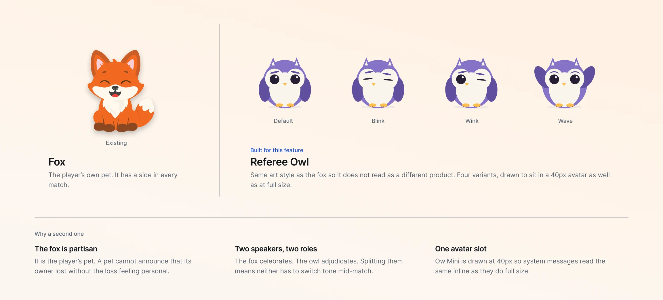
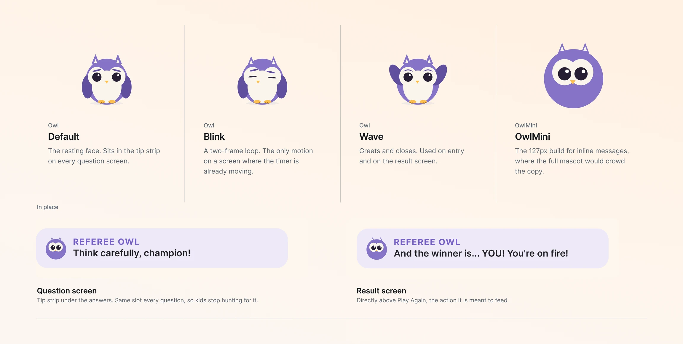
Each battle runs five questions on a twelve-second timer per round. The reveal screen shows both players' answers side by side with a Referee Owl commenting on the round. Learning isn't a separate screen users opt into, it's what happens between answer taps. The pacing matches what tested well for 8–15 year olds: short bursts, visible competition, immediate feedback. Speed without slowness, structure without lecture.
03.
Play Again, Not Buy with Coins
The post-win moment protects momentum instead of converting it.
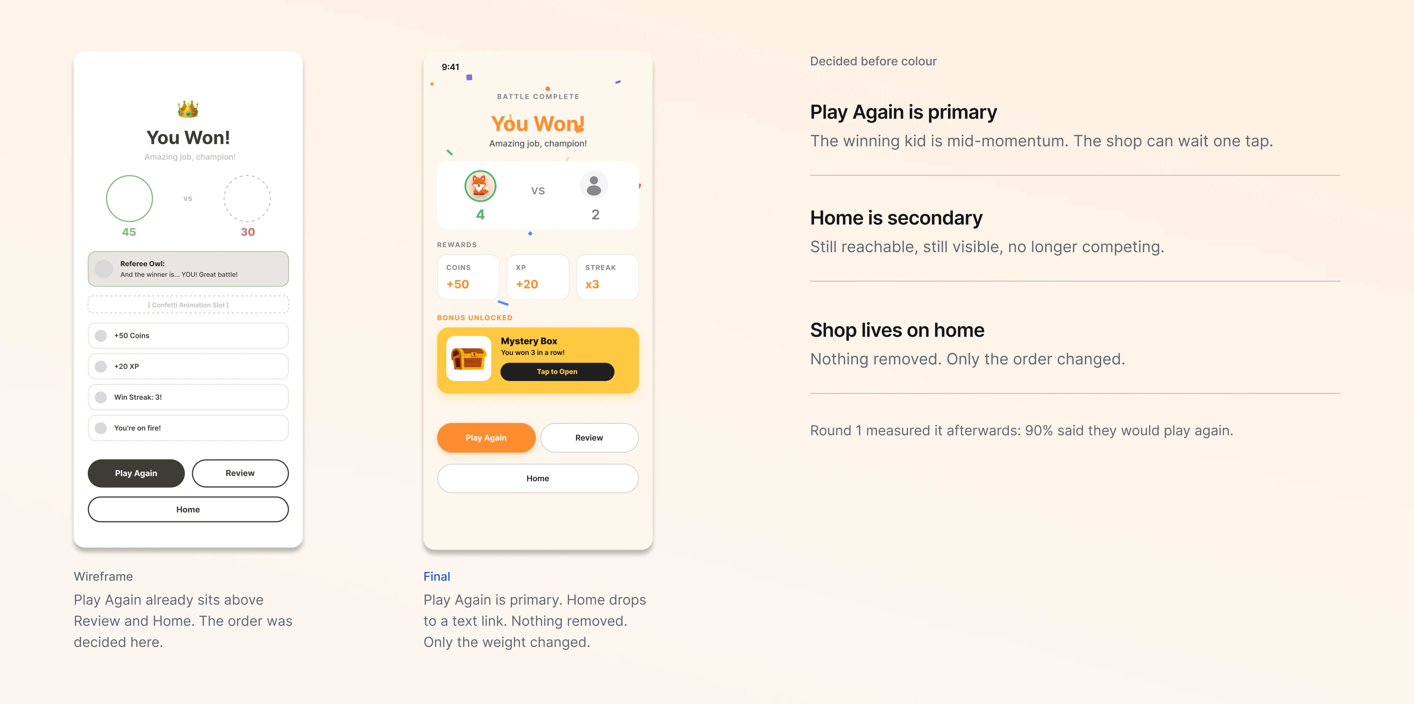
When users win, the primary CTA is 'Play Again', not 'Buy with earned coins'. This was the call where I pushed back hardest against the PM. The argument I built was grounded in Flow Theory and research on children's sensitivity to flow interruption: the moment right after winning is the worst possible moment to send a kid into a shop. Round 1 testing later validated the call. Ninety percent of participants said they'd play again.
Research
Why Redesign Now
FiPet had already shipped to the App Store, which was the central fact I came into. The decision had been made to launch without usability testing, and the result was visible in every available signal: App Store reviews kept flagging the same handful of problems, downloads were slow, retention was poor. The team had built a financial literacy app for kids and shipped it without verifying that the kids could actually use it.
The brief I was given was to redesign the experience around a new 1v1 Quiz Battle feature that the team had aligned on in a company-wide meeting. But before designing anything new, I wanted to understand what was wrong with the current product. App Store reviews told part of the story. I needed to hear from real users to get the rest.
I ran 10 user interviews with parents and kids, intercepted in public spaces over the course of a week, audited App Store feedback, and did a competitive audit of how other kids' apps handled engagement. The interviews kept circling the same insight: the product wasn't failing because the content was bad. It was failing because nothing about the experience around the content was built for kids.
What Other Kids' Apps Get Right
Apps that hold 8–15 year olds, Duolingo, Roblox, even Khan Kids, share a pattern: short sessions, visible progress, and a clear reason to come back. None of them lead with content. They lead with a hook. FiPet had content. It didn't have a hook. The original home screen treated kids like adult learners with a curriculum to complete, which is the opposite of how kids actually use their phones.
Apps that succeed with 8–15 year olds make a habit before they make a curriculum.
What the Interviews Surfaced
"It feels like homework. I don't expect my kids to play and learn through this app."
— Interview participant, age 35
Across the 10 interviews, the most consistent feedback wasn't about the financial content. It was about the experience wrapping it. Parents described the app as 'too much', visually overwhelming for their kids. One participant compared it to a textbook. Another said it felt like homework, which was exactly the frame the product was trying to avoid.
I ran the interviews in my first week at the company. Public intercepts in coffee shops, parks, and on the street, ten participants, parents alongside their kids, so I could observe how kids actually approached the app and how parents read what they were seeing. A formal focus group would have been better. Setting one up wasn't realistic in the time available. The pattern was unambiguous: kids opened the app once, weren't sure what to do, and didn't come back. The drop-off was at the moment of confusion, not at the moment of disengagement with financial content. Most kids never got far enough to be bored by the curriculum.
The design system was a significant part of the problem. Heavy gradients, mixed custom icons, and inconsistent type made the interface hard to parse before users could even engage with the content. A 10-year-old shouldn't have to decode the UI before they can learn about a budget.
10 user interviews · App Store review analysis · competitive audit (Duolingo, Khan Kids, Greenlight)
Key Research Findings
10 of 10 interview participants described the original FiPet as visually complex or overwhelming
Parents reported their kids opened the app once and did not return
App Store reviews repeated the same handful of issues: confusing flow, ambiguous icons, no fun factor
Competitive audit showed every successful kids' app led with a hook, not a curriculum
Industry research (Commonwealth Bank / Kit, 2023) found 78% of parents say gamification improves their kids' financial capability, supporting the team's instinct that competitive framing could work
Personas
Two groups shaped the design, and both got interviewed in the same session. The kids are the users. The parents are the decision-makers, the ones who install the app, watch their kid use it, and decide whether it stays on the phone. The redesign had to land for both, and the failure modes for each were different.
Design Goals
Three goals shaped the design phase, and I kept them visible in every working session: (1) establish a clean design system the whole team could use for the broader redesign, not just my feature; (2) design 30 hi-fi screens for the 1v1 Quiz Battle feature on an 8pt grid; (3) introduce usability testing as a practice so future decisions came from evidence, not gut feeling. The third goal was the one no one had asked for. It ended up mattering the most.
Design
The design phase had one constraint that shaped everything: 1v1 Quiz Battle had already been chosen as the feature. My job wasn't to invent it, it was to figure out the experience around it. That meant the design alternatives weren't about whether to ship a quiz battle. They were about how the home screen and battle loop framed it, and what made users want to come back. I explored two directions before the chosen one, and both got rejected for the same underlying reason.
Where the Real Problem Was
My first instinct was to redesign the lessons themselves, shorter modules, more visuals, gamification inside each one. The interviews kept pointing somewhere else. Kids weren't dropping off in the middle of a lesson. They were dropping off before the lesson started. The intervention point wasn't inside the curriculum. It was the home screen, and whether it answered the question of why anyone should open the app on day two.
So the design work focused on the loop, not the content. What does the user see first? What happens in the first 60 seconds? What makes them come back tomorrow? Every screen had to earn its place inside that question.
Two Directions Rejected
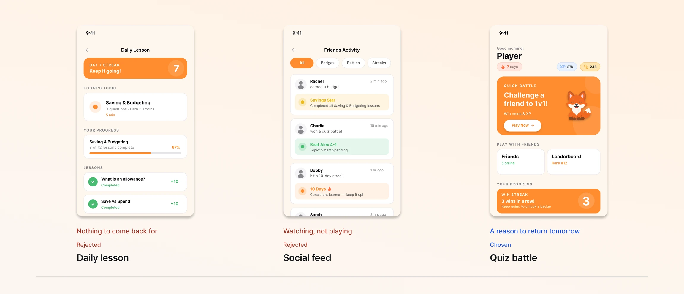
I explored three directions for the home screen, each built around a different theory of what would make Gen Z and Gen Alpha return to a financial literacy app. Two got rejected. The reasons matter as much as the result.
Technical feasibility
I scoped feasibility with the PM and the 10-person engineering team early. Multiplayer infrastructure was the biggest unknown, achievable in the timeline but expensive enough that the chosen direction had to justify the investment. The other two directions were both lower-effort to ship, which raised the bar for choosing the third, not lowered it.
Alternative 01
Daily lesson with streak
A Duolingo-style daily lesson with a visible streak counter on the home screen. Familiar pattern, low engineering effort.
PROS
Familiar pattern, low effort entry
Clear learning progression visible at a glance
Streak is a proven retention mechanic in adjacent products
CONS
Still solo, no social hook for an audience that lives socially
Streak alone wasn't enough for users who were already disengaged
No reason to open the app beyond self-discipline, which isn't an 8–15 year old strength
Alternative 02
Social feed of friend activity
A home screen feed showing what friends are learning and earning, badges, streaks, level-ups. Passive social presence instead of active engagement.
PROS
Introduces social presence, which interviews said users wanted
Peer visibility creates curiosity around what friends are doing
Low commitment, browsable without forcing an action
CONS
Too passive, no clear action to take
Users in concept tests said it looked like another Instagram
Hard to populate with meaningful content early on when the network is sparse
Direction 03
CHOSEN1v1 Quiz Battle as core action
Sixty-second quiz battles against a friend. The home screen leads with pending matches and invites. Competitive framing creates urgency to return.
PROS
Active, social, and time-bound, all three at once
Competitive framing tested strongest in concept reviews
Short session matches Gen Z attention patterns
Creates a real reason to open the app on day two
CONS
Required multiplayer infrastructure, the most expensive option to ship
Risks alienating users without friends on the app yet (handled with bot opponents at first)
Why I moved forward with this direction
Neither rejected direction created a real reason to open the app. The Daily Lesson was familiar but solo. The Social Feed was social but passive. The 1v1 Quiz Battle was the only direction where active, social, and time-bound held at once, and the only one where learning happened inside play, not before it. That phrasing surfaced during research and ended up shaping every downstream decision.
PM Pushback: Play Again vs. Buy with Coins
The hardest disagreement on this project happened after the chosen direction was locked. The Result screen, what users see right after winning a battle, became a real argument about who the product was for and what moment we were designing for.
The PM's position was 'Buy with earned coins' as the primary CTA. The logic was reasonable: users had just earned coins, conversion would never be higher, and a clear path to the shop reinforces the in-app economy. From a product perspective, this is exactly what you would build for a transactional adult user.
My pushback was about who the user actually was. 8–15 year olds aren't transactional. They're momentum-driven. The moment after winning a battle is an emotional high, competitive satisfaction, social proof, the visceral 'I want to do that again' feeling. Sending a kid to a shop in that exact moment interrupts the feedback loop the game was built to create. The shop should be reachable, not pushed.
I backed the position with three specific things: Flow Theory (Csikszentmihalyi, 1990) on the cost of interrupting peak engagement; a 2020 study (PMC) showing children are more sensitive to flow interruption than adults; and the 2023 Commonwealth Bank / Kit study showing 78% of parents say gamification improves their kids' financial capability, which means the metric that matters is habit formation, not transactions per session. The PM agreed. 'Play Again' became the primary CTA, with the shop accessible but not the primary path.
Round 1 usability testing later validated this. Ninety percent of participants said they'd play again. That number is what I'd point to if anyone ever revisited the call.
Key Design Decisions
Four decisions held the design together. Each came from a different source, some from interviews, some from heuristics, one from a research-backed argument with the PM. They all earned their place.
Visual simplification for a kids' audience
Interviews kept describing the original design as 'too much' for kids. I replaced the multi-color gradient palette with a flat cream background and a single orange accent (#FF8C2E). The interface had to be parseable by an 8-year-old before they could engage with the content. Visual complexity wasn't decoration, it was a barrier to entry.
Familiar UI conventions over visual novelty
The original app used custom icons users had to guess at. I replaced them with standard SVG line icons familiar from everyday mobile experiences. Clarity over novelty. A kid who already knows what a shopping cart icon means shouldn't have to learn a new symbol for the same thing.
Protect post-win emotional momentum
Backed by Flow Theory and research on children's sensitivity to flow interruption. I argued the post-win moment should preserve momentum, not interrupt it with commerce. The PM initially wanted commerce-first; the team adopted my proposal after the research-backed pushback. Round 1 testing later validated: 90% would play again.
Build a system, not just a screen
My tokens, #FF8C2E orange, Inter, 8pt grid, SVG icons, became the foundation for a broader app redesign beyond the Quiz Battle feature. Other designers used the same system for the screens they owned. The impact scaled past my feature, which turned out to be one of the more useful outcomes of the project.
Direction rejected
I initially prototyped a Lottie-based celebration on every correct answer, more energy, more fun. Once it was in the flow, the pacing got worse, not better: the animation broke the quick-question rhythm and added friction to a loop that was supposed to feel fast. I cut it down to a subtle scale-up on the Referee Owl and a color flash on the correct answer. The lesson: in a fast quiz loop, more motion isn't more engagement. It's more interruption.
What Shipped to Prototype
The final hi-fi prototype was 30 screens at 402×874, built on an 8pt grid, with Boolean variables driving state changes (the Done button is gray when disabled, orange when an answer is selected). The system extended past the Quiz Battle: other designers adopted it for the rest of the app redesign.
Single primary color: #FF8C2E
I reduced the multi-color palette to a single orange accent on a flat cream background. The original gradient-heavy palette had created visual noise that made the interface harder to parse, especially for the 8–15 audience who shouldn't have to decode the UI before learning about money. One accent color, applied consistently, gave the system an identity and gave kids fewer things to process at once.
SVG line icons familiar from mobile
The original app had custom icons whose meaning users had to guess at, plus emojis that rendered inconsistently across iOS and Android. I replaced both with standard SVG line icons from common mobile patterns. Clarity over novelty. The cross-platform rendering issue resolved itself once the icons standardized, an engineering complaint that fixed itself.
Inter throughout, migrated from Nunito
The original system used Nunito, which had weight inconsistencies at the small sizes our 14 base screens required. I migrated to Inter, which solved the consistency problem and gave the system a more neutral foundation. This was a legibility decision, not a brand decision. Kids need the type to recede so the content lands.
Quick Battle card as the primary home action
The original home screen led with a lesson list. The redesign leads with a Quick Battle card, challenge a friend now, win streak counter below it, friends online below that. The primary action on the home screen is the action we actually want users to take. That alignment between visual hierarchy and behavioral intent was what was missing in the original.


Usability Testing
Round 1 — Figma Prototype Testing
The Test
FiPet had shipped without a single usability test, which was the original problem. After designing the 1v1 Quiz Battle feature, the question wasn't whether to test. It was how fast we could get evidence before shipping the next iteration. I built the test plan in Maze, ran it against the hi-fi Figma prototype, and made it the first usability test in the company's history.
PARTICIPANTS
22 participants across the core task flow, 33 total responses across the full set of tasks and follow-ups. Recruited as adults briefed as proxies for the 8–15 target audience, direct child testing required parental consent infrastructure we didn't have yet, so adults walked through the task flows imagining they were the target age. 97% of participants were aged 16 or older.
METHOD
Maze prototype test with three core tasks: start a quiz battle, answer a question, complete all five questions. Each task surfaced a different layer of friction. Open-ended follow-up questions captured the reasoning behind specific moments of confusion or surprise. Three task flows, fourteen blocks total.
What We Found, and What We Changed
Each finding produced a specific refinement. The two-column structure below pairs the evidence with the design response.
FINDING 01
Start button below the fold caused a 65.9% misclick rate on the first task
EVIDENCE
22 participants tried to start a battle. 65.9% misclicked at least once before finding the right action. One participant put it plainly: "I didn't realize the start button was under the page, so I confused that as a buffer." Average task duration was 228 seconds, slow for what should have been an obvious entry point.
WHAT WE CHANGED
Repositioned the Start button above the fold in the V2 prototype, with a visible hint that it was the primary action.
WHY THIS FIX
A 65.9% misclick rate isn't a discoverability nudge, it's the design failing. The fix had to be structural, not visual. Moving the button above the fold was the only change that addressed the cause rather than the symptom.
FINDING 02
The auto-transition between questions felt too fast
EVIDENCE
Multiple participants flagged this directly. "It just turned to the next page too fast, so I'd say I need more time to read." Another participant was actively startled by the speed: "A new window suddenly popped up. I was expecting to move on to solving the next problem." Speed wasn't reading as engagement, it was reading as disorientation.
WHAT WE CHANGED
Added a 1.5-second delay between the answer reveal and the next question, giving users time to process the result before the next round started.
WHY THIS FIX
8–15 year olds aren't speed-readers. The original pacing matched what felt right to me as a designer, not what worked for the target audience. Speed isn't engagement at this age, comprehension is.
FINDING 03
The rival felt absent. The battle played like a solo quiz with a score at the end.
EVIDENCE
Direct participant quote: "It'd be nice to see what the rival responded and whether or not they answered correctly. Would make it feel like more of a quiz battle, rather than a quiz where you just find out your score at the end." In the favorite-element question, only 20% chose "Competing against a rival", the lowest of three options, behind "Seeing if I got the answer right" (50%) and "Learning about money" (30%).
WHAT WE CHANGED
Added the rival's answer visible alongside the user's on the reveal screen, plus a "rival is choosing their answer" waiting state during their turn so the back-and-forth was visible in real time.
WHY THIS FIX
The feature was named 1v1 Quiz Battle, but it played like a single-player quiz with a score comparison. The competitive tension had to be visible during the play, not just in the result. Naming a feature 1v1 isn't enough if the experience is functionally solo.
FINDING 04
Question text alone was hard for the target age to comprehend
EVIDENCE
Multiple participants asked for visual support. "Add images next to the question for better understanding." "Children might be confused with words." Another: "Maybe simple drawings? Cause it will be easier to understand by short memory than reading it." The pattern wasn't a stylistic preference, it was a comprehension request.
WHAT WE CHANGED
Added a small illustration alongside each question, themed to the question's financial concept.
WHY THIS FIX
Reading load is a different problem for 8–15 year olds than for adults. The question screen had to communicate the concept before it had to be read. The illustration carries half of that load and lets the text focus on the specific question.
FINDING 05
Round 1 participants wanted reward variability beyond winning the match
EVIDENCE
3 users quoted that they wanted more gamification elements and more dynamic reward layers throughout the quizzes to entertain the users
WHAT WE CHANGED
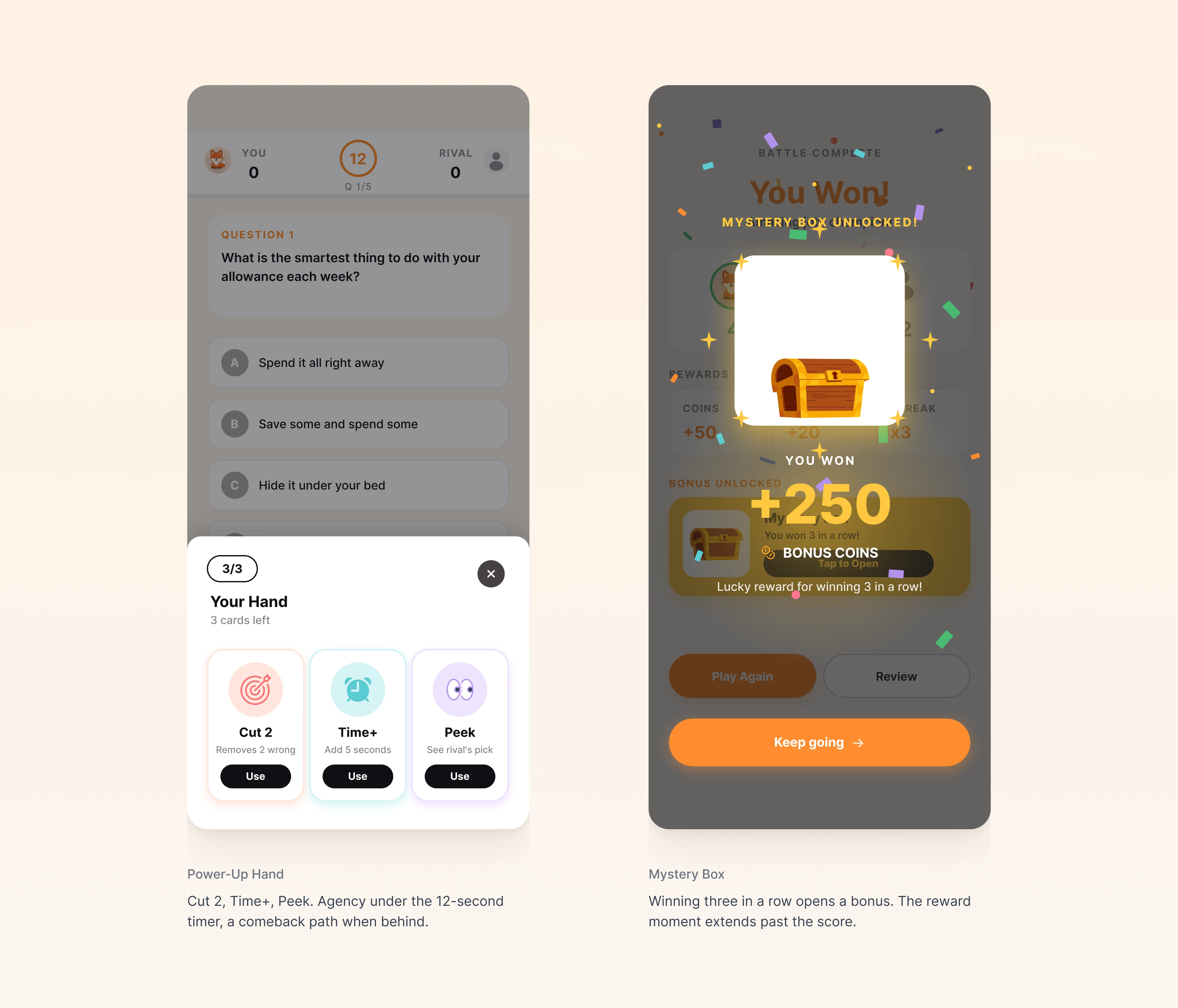
Added three Round 2 mechanics: a combo system (chaining correct answers triggers a streak multiplier on points), a mystery box reveal after each battle (variable reward instead of a fixed coin payout), and a daily missions track that funnels into the same mystery box reward on full completion.
WHY THIS FIX
Variable reward schedules sustain the "one more game" loop without forcing transactions, which extends the Play Again primary CTA decision from earlier. The mystery box becomes reachable through two parallel paths — in-session (post-battle) and cross-session (daily missions) — so the same reward anchors both immediate replay and next-day return. The Round 2 coded prototype tests whether this multi-path structure raises retention over Round 1 baseline.
Where This Led
Round 1 validated the macro design (90% would play again, 4.2/5 fun rating, 100% task success on the core flow) and surfaced four refinements specific enough to act on. Rather than iterate on the Figma prototype, I moved the refinements into a coded React prototype. Real timer behavior, real rival turn-taking, and real answer-switching couldn't be faithfully simulated in a static prototype, and Round 1 had made it clear those exact behaviors were where the remaining unknowns lived. Round 2 is currently running on the coded build.
WHAT THIS CHANGED
This was the first usability test in the company's history. The shift mattered more than any single screen: decisions moved from gut feeling to evidence. The team adopted testing as a default practice for the features that came after.
Prototype Spotlight
From Figma to Coded Prototype
Some things a static prototype couldn't validate.
After Round 1, the obvious next step was another Figma iteration. I argued against it. The remaining unknowns, real timer behavior, live score updates, rival turn-taking, answer-switching mid-question, couldn't be tested faithfully in a static prototype. So I built the next iteration in React, deployed it to Vercel, and ran Round 2 testing against the live build. The trade-off was time. The payoff was that the validation could now reflect the real behavior, not a Figma approximation of it.
Try the prototypeWhy a Coded Prototype
Four behaviors Figma couldn't simulate. Each one was the specific reason this section of the loop needed a real build to test honestly.
Real 12-second timer
Figma can mimic countdown UI but can't enforce timing. A coded prototype lets us observe what users actually do when the timer pressure is real, do they answer faster, switch answers, freeze, or rush?
Live score updates after each round
The score bar updating between rounds is part of the competitive tension. In Figma, this was a screen transition; in code, it's a state change with motion. The difference shapes whether users perceive the battle as live or scripted.
Answer-switching mid-question
Round 1 participants sometimes wanted to change their answer before the reveal. Figma's prototype mode couldn't support that. The coded version does, and Round 2 will tell us whether the option helps comprehension or creates indecision.
Rival turn-taking state
The 'rival is choosing their answer' waiting state needs real timing to feel like a 1v1, not a fake delay. The coded prototype runs the actual state machine for the turn handoff.
Outcome
Outcome
Round 1: 22 participants on the core task · Maze prototype testing · 3 task flows · open-ended follow-up · adults briefed as proxies for the 8–15 target audience. Round 2 currently running on the coded prototype.
Round 1 was the company's first usability test. It validated the macro design (90% would play again, 4.2/5 fun, 100% task success on the core flow) and produced four specific refinements that moved into a coded React prototype for Round 2. The design system I built for the Quiz Battle feature was adopted across the team for the broader app redesign. The shift the team is still feeling, the one that won't show up in a portfolio metric, is that decisions now start from data, not intuition.

Future Steps
Complete Round 2 Testing on the Coded Prototype
Round 2 is currently running. All four Round 1 refinements, Start button repositioning, 1.5s transition delay, rival visibility, question illustrations, are live in the coded build. The questions I want answered: does fixing the misclick close it to single digits? Does rival visibility actually shift the 20% 'competing against a rival' number on the favorite-element question? And does the 1.5s pacing land for the target age or feel too slow?
The most valuable signal from Round 2 will be whether the behavioral evidence matches the qualitative requests from Round 1. Participants told us what they wanted. Round 2 tells us whether what they wanted actually solved the problem they were describing.
Ship the MVP and Collect Real User Reviews
Usability testing answers questions a controlled task can answer. It can't answer whether users return on day three or day thirty. That's a production-data question, and the original FiPet ship had skipped both the testing and the measurement. The plan is to ship the MVP and track day-1, day-7, and day-30 return rates against the original baseline.
App Store reviews are part of the measurement plan too. The original ship was hurt most by the public review feedback. The redesign should be visible in that signal first, before any internal metric moves.
Integrate Gamification Effects per Engineer Feedback
Engineers proposed adding a combo system and a Mystery Box reward (both detailed in the Beyond section below). These weren't from Round 1 user findings. They came from designer- and engineer-anticipated patterns based on what makes similar games engaging. Round 2 includes both, and the test will tell us whether they materially shift the 4.2/5 fun rating, or whether they read as decorative.
Track Play Again vs. Buy Engagement Post-Launch
The PM and I agreed to revisit the 'Play Again' vs. 'Buy with coins' CTA decision post-launch with real engagement data. If shop entry rate is healthy through the secondary path, the call holds. If commerce conversion craters in a way that doesn't show up in usability testing, we revisit. This was the deal that made the pushback land in the first place, I argued the call; we agreed to test it in production.
What I Learned
Introducing testing changed the team's culture more than any single screen
FiPet had shipped without usability testing. Adding it wasn't a process tweak, it shifted how the team made decisions across the board. The PM stopped defending preferences with intuition; engineers stopped pushing back on UI choices with their own assumptions. Once everyone had a shared evidence base, the arguments got smaller and the work got faster. That cultural shift was probably more valuable than any specific finding the test produced.
A design system is judged by adoption, not coverage
I built the tokens for my feature, #FF8C2E orange, Inter, 8pt grid, SVG icons. The unexpected outcome was that the rest of the team adopted the same system for the broader app redesign. That happened because the system was scoped tight enough to actually use, four decisions, not forty, and because I shipped a short documentation set alongside the Figma file. A design system that's complete but unused is worse than a smaller one that ships. Adoption is the metric.
Research-backed pushback works when it's specific
The 'Play Again' vs. 'Buy with coins' argument was won by three specific citations: Flow Theory, the children's flow-interruption study, the gamification capability research. Not by 'I think kids will prefer this.' The PM had a defensible position, and my position needed to be more defensible. Specificity is what made the pushback land instead of stalling, and what made the PM willing to update.


